

The stock market is at extreme valuations only seen in 1929, 2000, and 2007. It is being propped up by the belief that Bernanke’s QEternity can permanently keep stock valuations valued 50% higher than historical relationships would predict. Is this time different? The answer to this question reveals whether you are a delusionist or realist.
Hussman’s article is long and filled with charts, so I’ll pick out the key takeaways.
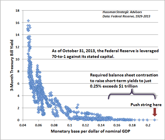
A brief update on the bloated condition of the Federal Reserve’s balance sheet. At present, the Fed holds $3.84 trillion in assets, with capital of just $54.86 billion, putting the Fed at 70-to-1 leverage against its stated capital. Given the relatively long maturity of Fed asset holdings, even a 20 basis point increase in interest rates effectively wipes out the Fed’s capital. With the present 10-year Treasury yield already above the weighted average yield at which the Fed established its holdings, this is not a negligible consideration.
Notice though, that after the 0.25% interest that the Fed pays banks to hold their reserves idle, the Fed still turns over more than 2% in interest annually to the Treasury from its debt holdings. At an estimated portfolio duration of about 8 years, it actually takes an increase in interest rates of about 0.25% annually for capital losses to wipe out interest earnings, thereby turning monetary policy into fiscal policy by creating net losses to the Treasury. Essentially, to the extent that the Fed eventually closes its holdings at a net loss, it would be as if the Treasury borrowed at a higher interest rate than it otherwise might have.
The main concern is that the more the Fed’s balance sheet expands, the more likely it is that the exit will be problematic. Already, a normalization of Treasury bill yields to even 0.25% would require a balance sheet contraction of over $1 trillion, or additional payments to the banking system approaching $10 billion annually in order to keep reserves idle. Such payments would predictably become politically contentious very quickly. Considering how glorious the expansion of the Fed’s balance sheet has been for investors, we should not be surprised if the eventual normalization turns out to be equally inglorious.
In any event, I continue to believe that it is plausible to expect the S&P 500 to lose 40-55% of its value over the completion of the present cycle, and suspect that whatever further gains the market enjoys from this point will be surrendered in the first few complacent weeks following the market’s peak. That’s how it works. If all of this seems like hyperbole, please recall my similar concern at the 2007 peak (see Fair Value – 40% Off), and the negative 10-year return projections – even on best-case assumptions – that we correctly estimated for the S&P 500 in 2000. These numbers relate to the striking gap between present valuation levels and normal historical precedent, not to personal opinion.
Leash the Dogma
John P. Hussman, Ph.D.
It’s fascinating to hear central bankers talk about the economy, because in the span of a few seconds they can say so many things that simply aren’t supported by the evidence. For anyone planning to watch the confirmation hearings for the next Fed Chair, the evidence below is provided as something of a leash to restrain the attacking dogma.
There’s a lot of ground to cover this week – the Phillips Curve, quantitative easing, the Fed’s bloated balance sheet, the “wealth effect,” the misguided “dual mandate,” and the largely unrecognized bubble in stock prices. We have a Federal Reserve relentlessly pursuing a “trickle down” monetary policy that has weak economic effects, thin historical support, and ominous implications for future investment outcomes and the stability of the financial markets. So let’s get started.
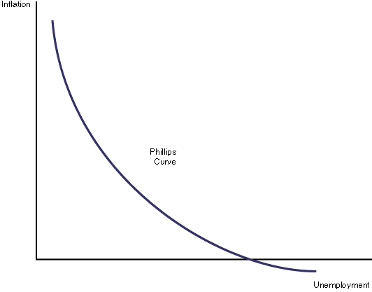
The Phillips Curve
Consider first the notion of the “inflation-unemployment tradeoff” – the so-called Phillips Curve. Part of the reason that investors fall for this idea so easily is that many of them learned it from a nicely drawn diagram in some economics textbook. Like the one below. The idea is that as the unemployment rate rises, inflation falls, and as unemployment falls, inflation rises. The belief in this tradeoff has become so dogmatic that economists often comment about how we might intentionally target a higher rate of inflation in order to bring the unemployment rate down. Nice, clean diagrams lend themselves to such simplistic and dogmatic thinking.
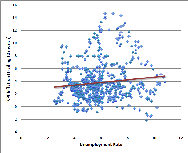
Below is what the actual data look like, depending on exactly how the proposed relationship is stated.
The first chart shows the relationship between the unemployment rate and the most recent year-over-year inflation rate. The relationship isn’t even downward sloping, but more importantly, it’s extraordinarily noisy. The clean curves presented in textbooks are so much more convenient.
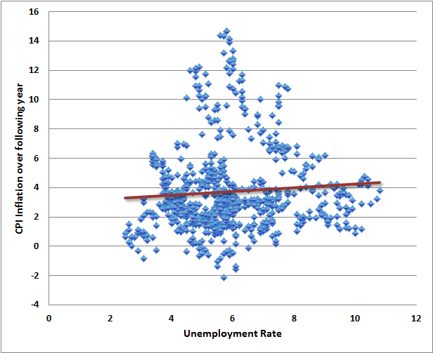
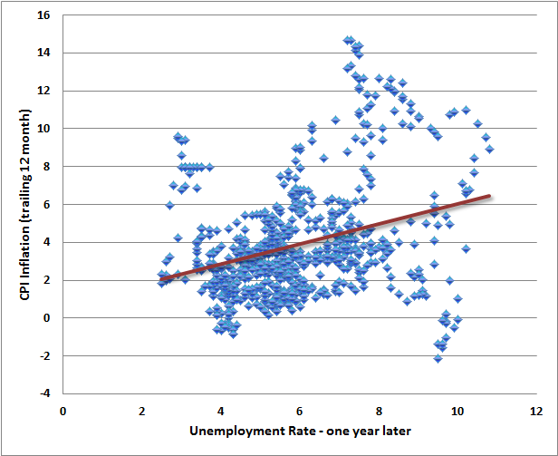
The next chart is what people have in mind when they think of low unemployment causing inflation, and high unemployment as causing deflation. The chart shows the unemployment rate versus the CPI inflation rate one year later. Again, the relationship slopes the wrong way, but is in any case an insignificant relationship lost in a cloud of noise.
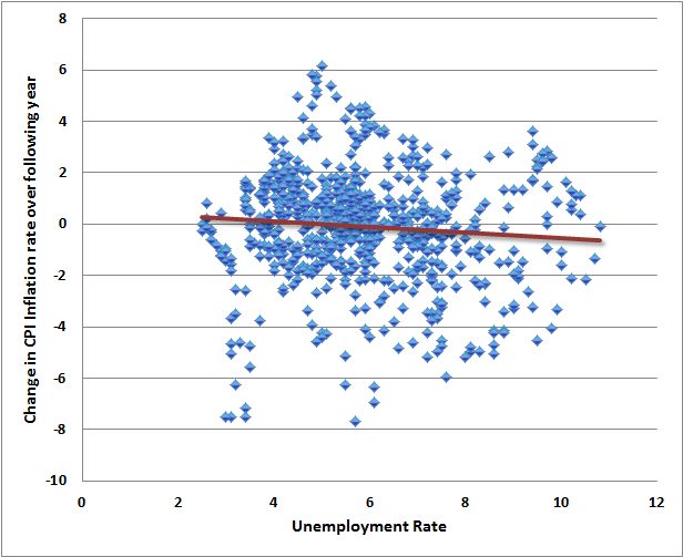
Of course, one might argue that the Phillips curve is best stated as a relationship between the unemployment rate and the change in the inflation rate over the following year. This one at least gets the sign of the relationship right, but that relationship is again insignificant relative to the surrounding noise.
The next chart is what people have in mind when they think of reducing unemployment by allowing higher inflation. It shows the relationship between the CPI inflation rate, and the unemployment rate in the following year. If one believes that raising inflation is a way of lowering unemployment, the data is completely unsupportive. In the real world, inflationary periods often feature economic and speculative imbalances that are followed by recession and higher unemployment.
Without torturing every permutation of this relationship, suffice it to say that the foregoing clouds of noise and weak relationships show up in every other statement of the inflation-unemployment tradeoff, regardless of whether one uses levels, changes, trailing data, subsequent data, CPI inflation, core inflation, or mixtures of all of these.
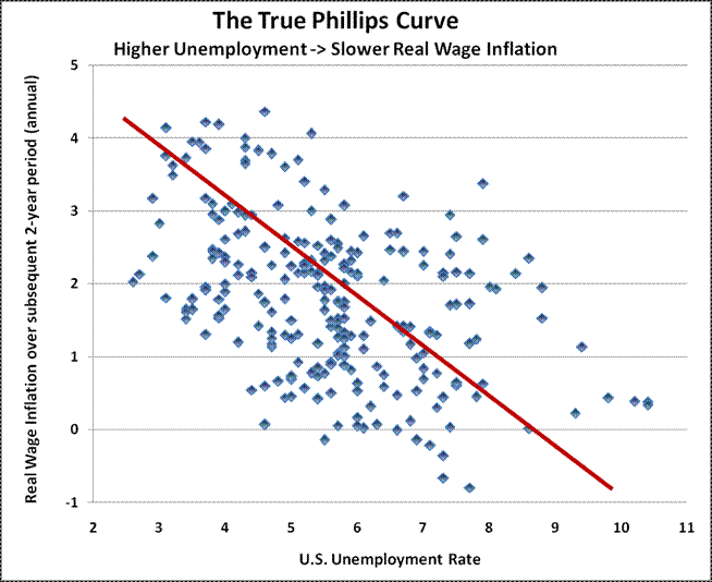
What’s perplexing about this entire inflation-unemployment argument is that the original “Phillips Curve” proposed by A.W. Phillips in 1958 was a relationship between unemployment and wage inflation, based on century of data where Britain was on the gold standard and general price inflation was virtually non-existent. So the Phillips curve is actually a relationship between unemployment and real wage inflation.
The resulting relationship can be stated very simply: wages rise, relative to other prices, when unemployment is low and labor is scarce; wages fall, relative to other prices, when unemployment is high and labor is abundant. The chart below nicely illustrates this relationship in U.S. data. It relates current unemployment to subsequent real wage inflation.
Unfortunately, even the true Phillips curve is emphatically not a relationship that can be manipulated to create jobs or lower the unemployment rate. The natural response of policy-makers and economists has been to ignore Phillips’ original formulation and torture the data instead. This torture usually takes the form of an “expectations augmented” Phillips Curve. This is the notion that various levels of inflation get built into expectations, causing the Phillips Curve to shift up and down over time, but retaining a “short-run” tradeoff that can be manipulated.
The concept of a “natural rate of unemployment” is closely related – the basic idea is that the Phillips Curve shifts up and down over time, but can still be manipulated by clever policy makers with compassion and vision. The red lines give some idea of the proposed torture to the data.
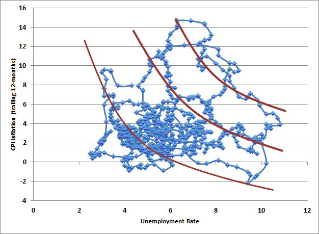
Even these short-run “Phillips Curves” are overwhelmed by noise unless one draws so many that every few consecutive points represent a separate little Phillips Curve – and half of them would slope the wrong way. When one compares this mess with the true Phillips Curve – an unambiguous relationship between unemployment and real wage inflation, it’s evident that these alternate formulations are an effort to bend the evidence to support an interventionist dogma.
Quantitative Easing
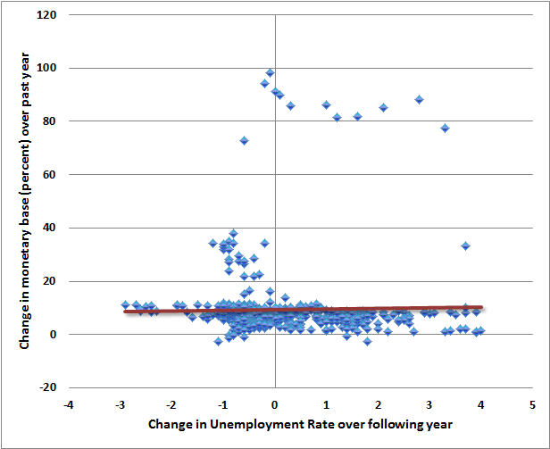
The same sort of dogma can be found in other discussions of monetary policy and its presumed effectiveness. For example, quantitative easing essentially proposes that rapid increases in the monetary base can achieve reductions in the unemployment rate. But when we examine the data, we find very little to support this view, regardless of whether the relationship is posed in terms of growth rates, levels, changes, coincident changes, or subsequent changes in unemployment.
Of course, quantitative easing has had an enormous effect on the stock market in recent years. That’s not because there is any historical relationship between changes in the monetary base and the stock market prior to 2008. Indeed, in data prior to 2008, the correlation between growth in the monetary base and returns in the S&P 500 during the same year is almost exactly zero (slightly negative, actually), while the pre-2008 correlation between growth in the monetary base and returns in the S&P 500 over the following year is also almost exactly zero (again slightly negative).
Though one can show a very high correlation between the level of the monetary base and the level of the S&P 500 since 2008, the fact is that two reasonably diagonal lines will almost always be correlated more than 90%. The rule is simple – if two lines run diagonally without a great deal of intervening variation relative to that trend, the correlation will always be nearly perfect, whether or not there is any mechanistic relationship between them at all. If you have a four-year old child, I can nearly guarantee that over the past four years, the correlation between the level of the S&P 500 and the height of your child has been over 90%. Heck, since the end of 2008, the correlation between the S&P 500 and a diagonal line has been 95%.
In my view, most of the response to quantitative easing reflects psychological factors rather than mechanistic ones. Certainly the scale of QE has been enormous, and suppressed short-term interest rates have undoubtedly motivated a reach-for-yield in more speculative assets. But it remains true that the amount of credit market debt in the U.S. is roughly 19 times the current size of the monetary base (with an average maturity of about 5-6 years), while the value of U.S. equities is easily over 6 times the monetary base. So quantitative easing effectively relies on the extent to which investors shun zero-interest cash amounting to less than 3.9% of that available portfolio. In any environment where low-interest but liquid and non-volatile securities become desirable as even a small part of investor portfolios, quantitative easing is likely to lose its presumed ability to “support” financial markets.
The other psychological contributors to the recent success of quantitative easing are the sheer novelty of QE, as well as the misattribution of the 2009 market rebound to monetary policy instead of the more logical, immediate, and salient factor – the abandonment of “mark-to-market” rules by the Financial Accounting Standards Board. In our view, the crisis ended on precisely March 16, 2009 (see The Grand Superstition), and had little to do with monetary policy.
The Fed’s Balance Sheet
A brief update on the bloated condition of the Federal Reserve’s balance sheet. At present, the Fed holds $3.84 trillion in assets, with capital of just $54.86 billion, putting the Fed at 70-to-1 leverage against its stated capital. Given the relatively long maturity of Fed asset holdings, even a 20 basis point increase in interest rates effectively wipes out the Fed’s capital. With the present 10-year Treasury yield already above the weighted average yield at which the Fed established its holdings, this is not a negligible consideration.
Notice though, that after the 0.25% interest that the Fed pays banks to hold their reserves idle, the Fed still turns over more than 2% in interest annually to the Treasury from its debt holdings. At an estimated portfolio duration of about 8 years, it actually takes an increase in interest rates of about 0.25% annually for capital losses to wipe out interest earnings, thereby turning monetary policy into fiscal policy by creating net losses to the Treasury. Essentially, to the extent that the Fed eventually closes its holdings at a net loss, it would be as if the Treasury borrowed at a higher interest rate than it otherwise might have.
The main concern is that the more the Fed’s balance sheet expands, the more likely it is that the exit will be problematic. Already, a normalization of Treasury bill yields to even 0.25% would require a balance sheet contraction of over $1 trillion, or additional payments to the banking system approaching $10 billion annually in order to keep reserves idle. Such payments would predictably become politically contentious very quickly. Considering how glorious the expansion of the Fed’s balance sheet has been for investors, we should not be surprised if the eventual normalization turns out to be equally inglorious.
The Wealth Effect
Regardless of whether or not the faith of investors in quantitative easing is based on misattribution and superstition, hasn’t the perception of its effectiveness been behind the recent advance in stock prices? The answer in the short run is an emphatic “yes.” There is no question – and we have no argument – that quantitative easing has been the primary driver of what we view as a dangerously speculative advance in equities.
Indeed, the whole point of quantitative easing, if one listens to Ben Bernanke, appears to rely on a belief that higher securities prices will make investors feel wealthier and will go out and spend, thereby creating economic demand and encouraging job creation. In effect, the Fed is pursuing what my friend John Mauldin calls “trickle-down monetary policy” – the idea that if the Fed can make the rich richer, the benefits will drizzle down to the unwashed masses. And so, Fed policy has relentlessly sought to create what is now the widest U.S. income distribution since 1929, just before the Great Depression.
The truth is that Fed policy has the capacity to do enormous damage by adding fuel to asset price bubbles when investors are already inclined to take risk, yet has very little power to “support” asset prices when investors are inclined to avoid risk (see Following the Fed to 50% Flops). The confidence that the Fed can, in all circumstances, drive asset prices higher is largely psychological – mostly due to misattributing the 2009 recovery to monetary policy instead of the move to end “mark to market” accounting. Yet even to the extent that stocks have been driven higher, there is very little evidence that the “wealth effect” on jobs and economic activity has been large. This is something that the Fed should have understood years ago.
So let’s go to the data and examine the “wealth effect.”
The chart below presents the most generous interpretation of the “wealth effect” that we can identify in the data. There is clearly a positive relationship between stock market changes and changes in real GDP over the same and subsequent year (after that, the relationship becomes negative and much of the temporary gain is lost). The relationship explains about 18% of the historical variation in real GDP growth rates. But notice the effect size. Essentially, each 1% change in the S&P 500 is associated with a temporary change of about .05% in GDP growth over the following two years, reversing after that point. So if correlation was causality, and dollars were doughnuts, the best-case scenario for QE – assuming that the correlation could be perfectly manipulated – is that driving stock prices up by 50% might help to generate a temporary increase in GDP growth of about 2.5% over what it might have been otherwise. Of course, to the extent that the increase in asset values was artificial, the opposite contraction could then also be expected.
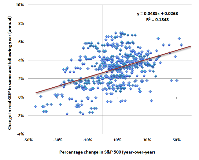
When we look more carefully at the relationship between stock prices and GDP, an additional problem emerges. Specifically, this relationship cannot be usefully manipulated, as all of the correlation between stock market changes and economic growth is captured in periods where stocks were rebounding from prior lows.
See, stock market troughs tend to precede economic troughs by a few months, and stock market recoveries from those troughs tend to precede subsequent economic recovery. It turns out that the entire relationship between stock price changes and economic changes is captured by the 30% of historical periods when stocks were at least 10% below their prior two-year highs. If one excludes these periods, the relationship between stock market gains and economic gains in the other 70% of the data vanishes completely.

So the Fed is attempting to exploit an already weak relationship between stock prices and economic growth, with the further complication that nearly all of this relationship is due to the co-cyclicality of stock prices and GDP, rather than being a true wealth effect. Friedman and Modigliani were right – consumers spend based on their assessment of their lifetime “permanent income,” not based on temporary fluctuations in volatile asset prices.
All of the above applies equally to the unemployment rate. In general, each 2% variation in GDP from trend-growth is accompanied by a 1% move in the unemployment rate in the opposite direction (a regularity known as Okun’s Law). Nearly all of the relationship between stock prices and changes in the unemployment rate, like GDP, are captured in the 30% of periods where stock prices were depressed by at least 10% relative to their two-year highs. There is simply no evidence in the historical record that stock market changes and unemployment changes are related outside of those periods of recovery.
The Dual Mandate
To some extent, one can’t blame the Fed for the weakness of recent economic progress, despite the massive financial distortions it has created. The dual mandate to pursue “stable prices” consistent with “maximum employment” asks the Fed to pursue employment outcomes that are poorly related to its instruments. That mandate is a relic of a long-discredited dogma that the Phillips Curve applies to general prices instead of real wages, and that the relationship can be manipulated. Unfortunately, Ben Bernanke and Janet Yellen still appear to believe this.
As former Fed Chairman Paul Volcker recently observed:
“I know that it is fashionable to talk about a “dual mandate” — that policy should be directed toward the two objectives of price stability and full employment. Fashionable or not, I find that mandate both operationally confusing and ultimately illusory: operationally confusing in breeding incessant debate in the Fed and the markets about which way should policy lean month-to-month or quarter-to-quarter with minute inspection of every passing statistic; illusory in the sense it implies a trade-off between economic growth and price stability, a concept that I thought had long ago been refuted not just by Nobel prize winners but by experience.
“The Federal Reserve, after all, has only one basic instrument so far as economic management is concerned—managing the supply of money and liquidity. Asked to do too much—for example, to accommodate misguided fiscal policies, to deal with structural imbalances, or to square continuously the hypothetical circles of stability, growth, and full employment—it will inevitably fall short. If in the process of trying it loses sight of its basic responsibility for price stability, a matter that is within its range of influence, then those other goals will be beyond reach.”
The Fed, very simply, is pushing on a string. It is a dogmatic effort that is unsupported by historical evidence. Even to the extent that the Fed’s efforts have “worked” in driving stock valuations higher, much of this effect is due to psychological, rather than mechanistic, relationships. In the words of Zorba the Greek, the “full catastrophe” of economic life here is driven by dogma and superstition. This will end very badly.
Stock Valuations – an unrecognized bubble
Recently, as part of his book promotion tour, Alan Greenspan has hit the media circuit. His remarks include the assertion that stocks are still attractively valued, based on his estimate of the “equity risk premium.” See Investment, Speculation, Valuation, and Tinker Bell for a full discussion of the Fed Model, “equity risk premium” calculations, and a variety of far more reliable valuation methods that are tightly associated with subsequent S&P 500 total returns.
The simple fact is that on metrics that have been reliable throughout history, and even over the past decade, stock market valuations are obscene. Importantly, these same valuation metrics were quite optimistic about prospective market returns at the 2009 low.
As a side-note, one should not confuse the message with the messenger here. It’s no secret that my insistence on stress-testing our return/risk estimation methods against Depression-era data resulted in missed returns in the interim (2009-early 2010), but none of that reflects our valuation metrics, which indicated prospective 10-year S&P 500 total returns in excess of 10% annually at the time. The real concern in 2009 was that even after similar valuations were observed during the Depression, the stock market still went on to lose two-thirds of its value. So I’m quite open to criticism about my insistence on stress-testing (which I still believe was a fiduciary obligation given the events at the time). But one should be careful in concluding that this removes the ominous implications of present valuations.
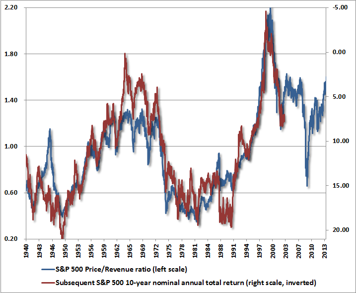
On the basis of a wide variety of historically reliable fundamentals, we currently estimate 10-year S&P 500 nominal total returns of just 2.5% annually. Notably, the Shiller P/E (S&P 500 divided by the 10-year average of inflation-adjusted earnings) is now at 25. Prior to the late-1990’s bubble, the only time the Shiller P/E was higher was during three weeks in 1929 that accompanied the extreme peak of the market before stocks crashed. Meanwhile, the price/revenue ratio of the S&P 500 is presently 1.6 – a level that is double its pre-bubble norm, and even further above levels historically associated with bear market lows.
We observe similar extremes in other reliable measures that aren’t dominated by cyclical movements in profit margins. The apparently “reasonable” market valuations based on margin-sensitive fundamentals (e.g. forward operating earnings) implicitly assume that all of history can now be ignored: profit margins will no longer be highly cyclical; margins will no longer vary as the mirror image of deficits in combined household and government savings (see Taking Distortion at Face Value); and they will instead permanently remain more than 70% above their historical norm.
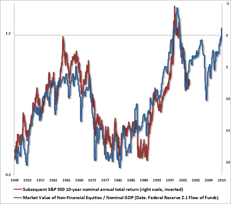
Aside from the fact that we can fully explain the present surplus of corporate profits as the mirror image of deficits in the household and government sectors, the other reason to focus on normalized earnings, cyclically-adjusted earnings, revenues, and other “smooth” fundamentals is simple: they are strikingly accurate guides across history. Another such measure is the ratio of stock market capitalization to nominal GDP, based on Federal Reserve Z.1 Flow of Funds data. Again, the present multiple is about double the historical pre-bubble norm.
While the valuation of the S&P 500 Index itself was higher in 2000, it’s notable that the overvaluation of the S&P 500 was skewed in 2000 by extreme overvaluation in very large-capitalization stocks, while smaller capitalization stocks were much more reasonably valued. In contrast, we have never in history observed the median stock as overvalued as we observe presently. Indeed, the median price/revenue ratio of stocks in the S&P 500 now exceeds the 2000 peak. Likewise, as Damien Cleusix has observed, if we examine valuations by quartiles (25% of stocks in each bin), the average price/revenue ratio of the two middle quartiles also exceeds the 2000 extreme.
For the sake of completeness, I should also note that virtually every “overvalued, overbought, overbullish” syndrome we define is on red alert. I hesitate a bit on this point, because in contrast to nearly a century of market history where these syndromes were reliably associated with deep losses, the emergence of these syndromes since late-2011 has repeatedly been followed by yet further speculation (see the chart in The Road to Easy Street). My impression remains that this is not a permanent change in market dynamics, but simply reflects an anvil that has not yet dropped. So these syndromes have admittedly done us no favors in the more recent period. Still, it remains our job, and our discipline, to view market action within its full historical context.
Among the many largely equivalent ways to define an overvalued, overbought, overbullish syndrome, the blue bars on the following chart present one of the many we observe at present: Shiller P/E anywhere above 18 (overvalued), S&P 500 at a 5-year high and at least 8% over its 40-week smoothing (overbought), with bullish sentiment greater than 50% and bearish sentiment less than 20% based on Investors Intelligence figures (overbullish). Notice that we did not observe this particular variant in 2000 because bearish sentiment never fell below 20% in that year. Also, while sentiment data was not available in 1929, we can impute sentiment reasonably on the basis of past price movements. Using imputed sentiment, we can also include 1929 in the set of instances here.
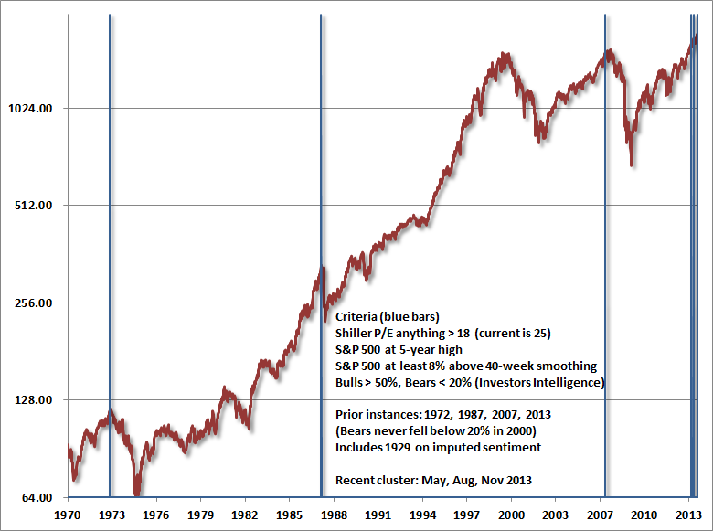
Notice that we’ve observed three instances this year – in May, in August, and today. Given the lack of follow-through from recent syndromes, we have to at least allow for the possibility of a further blowoff, as the seduction of quantitative easing has encouraged investors to ignore these conditions. On the economy, the best we can say is that while some widely-followed Fed surveys and Purchasing Managers indices have improved modestly in recent months, the most recent rolling correlation between these measures and actual economic outcomes (employment growth, industrial production) has become even more negative at the same time (see When Economic Data is Worse than Useless). Again, my impression is that this is not a permanent change in economic dynamics, but a temporary effect of distortions from quantitative easing, but it does force us take a more agnostic view of the economy than we might otherwise have.
In any event, I continue to believe that it is plausible to expect the S&P 500 to lose 40-55% of its value over the completion of the present cycle, and suspect that whatever further gains the market enjoys from this point will be surrendered in the first few complacent weeks following the market’s peak. That’s how it works. If all of this seems like hyperbole, please recall my similar concern at the 2007 peak (see Fair Value – 40% Off), and the negative 10-year return projections – even on best-case assumptions – that we correctly estimated for the S&P 500 in 2000. These numbers relate to the striking gap between present valuation levels and normal historical precedent, not to personal opinion.
None of our own challenges in this decidedly unfinished half-cycle relate to our consistent ability to correctly assess long-term investment prospects. We may yet see some amount of further short-term speculation, but already for the median stock, the long-term investment outlook has never been worse.
The foregoing comments represent the general investment analysis and economic views of the Advisor, and are provided solely for the purpose of information, instruction and discourse. Only comments in the Fund Notes section relate specifically to the Hussman Funds and the investment positions of the Funds.
Fund Notes
As of last week, Strategic Growth Fund remained fully hedged, with a “staggered strike” position that raises the strike prices of its index put options somewhat closer to present market conditions. With the resurgence of multiple “overvalued, overbought, overbullish” syndromes on a wide range of criteria, we have no basis to speculate on a further short-term blowoff here, even though we can’t rule it out. My impression is that even very short-term measures are stretched, so some amount of retreat in overbought conditions and overbullish sentiment might encourage a modest position in index call options as a constructive hedge against any climax in the recent speculative run (though remaining well-hedged otherwise due to longer-horizon concerns). We’ll let the evidence drive our discipline. For now, we remain defensive. Meanwhile, Strategic International remains fully hedged. Strategic Dividend Value remains hedged at about 50% of the value of its stock holdings. In Strategic Total Return, we clipped our precious metals holdings back to about 5% of assets early last week, also taking the duration of the Fund below 6 years (meaning that a 100 basis point move in interest rates would be expected to impact Fund value by less than 6% on the basis of bond price fluctuations). The Fund presently holds about 4% of assets in utility shares.

Those graphs and scatter-plots are really beautiful, but what do they mean?
Faith in our lord, Jesus Christ, has last 2013 years. Faith in Bubbles Bernanke, ‘Ol Yellen, and our green fiat currency may not last that long.
For AWD only ….. a chart he can understand
[img [/img]
Way off topic but after Stucky posted the chart above this seemed like the perfect place to post the Pussy Song by The Asylum Spankers. It’s the kind of tune you sing to yourself all day. Don’t judge the band by this one song either as they are (were actually) fantastic.
I_S
Wow! I had no idea the thing would embed itself just by posting the link.
I_S
IS,
[img]https://encrypted-tbn3.gstatic.com/images?q=tbn:ANd9GcS_sbhVyq3S34pwUKcvM8sY_9tXs0QTLF2aJuzoz_KVK2noJXst[/img]
It ain’t all honey and cream.
But some of it is.
[img]https://encrypted-tbn2.gstatic.com/images?q=tbn:ANd9GcSP7NKLLmeT9eJ_3SlylIGdJg6vcV_6JgM_8-bnuIe-poJnvQBxJw[/img]
LOL!
The country could be on the cliff, and a serious article post devolves to pussy comments! When the shit hits the fan, I want to hang with you guys.
Now now, dont worry Christmas is coming, millions of Smithfield (China owned) hams will be sold along with billions in cheap plastic toys sporting American brand names and they will buy a trilion in treasuries!!