QUOTES OF THE DAY

“GM rallied 7% on news of massive job cuts. How ghoulish. I wonder how high the market will be when robots are doing all the work and there are no jobs at all for human workers. Will the robots have savings to invest? How will the robots fund their children’s education?”

Lee Adler

“Make America Great Again”

Donald Trump

2015 Average Wages Up 1.9%; Median Household Income Up 5.2%! Yeah, That’s The Ticket

New York Times- Binyaming Applebomb-  Household incomes for American families rose strongly in 2015, breaking a yearslong pattern of income stagnation. The median household’s income in 2015 was $56,516, an increase of 5.2 percent over the previous year — the largest one-year rise since at least 1967, the Census Bureau reported on Tuesday.

Wowza! We’re on our way now!

The income gains represent an important turning point in the recovery from the 2008 recession, showing that recent economic gains are being distributed more broadly.

“It has been a long slog from the depths of the Great Recession, but things are finally starting to improve for many American households,” said Chris G. Christopher Jr., director of consumer economics at IHS Global Insight.

The economic recovery, however, remains incomplete. The median is still 1.6 percent lower than in 2007, before the recession. It also remains 2.4 percent lower than the peak reached during the boom of the late 1990s…

Still, most economists saw the report as remarkably positive. In an exuberant tweet, Jason Furman, chairman of the White House Council of Economic Advisers, called it “unambiguously the best” such census data “ever.” Household incomes in 2015 were higher than when President Obama entered office, and it is likely that the gains are continuing during his final year in office.

Binny usually covers the Fed, and usually gets said coverage wrong, but this piece probably wins the Pull-it-sir for breathlessness.

Continue reading “2015 Average Wages Up 1.9%; Median Household Income Up 5.2%! Yeah, That’s The Ticket”

The Daily Data Dive: Not The Best Time In History To Invest In Real Estate, Part 1

According to Jeff Reeves at Marketwatch, this is the best time in history to invest in real estate. Having spent half my professional life in the real estate business and the real estate finance businesses, let’s just say I was “curious” as to how he reached that conclusion. So I wiped the chocolate milk off my face that I had just spit up through my nose, took a deep breath, and dove in.

Reeves started out on the right foot:

Ads for house-flipping seminars have returned to AM radio and late-night cable TV in many markets — and so have Better Business Bureau complaints. So-called “liar loans” or “Alt-A mortgages” that played a big role in the housing crash are increasing in popularity. And, of course, there are the fears that a low-interest-rate environment has already prompted everyone to refinance and has artificially created demand for housing thanks to cheap access to mortgages.

Correct!

But it was only a diversion. What followed was either disingenuous, desperate, or delusional.

Continue reading “The Daily Data Dive: Not The Best Time In History To Invest In Real Estate, Part 1”

Here’s How Bad US New Home Sales Are

The Census Bureau’s monthly update on new US home sales for May had lots of interesting data buried between the lines. I’ll touch on a few things here, with more to come in a subsequent post.

First, while prices rose only 1% year over year, they are now up nearly 31% since the 2011 lows and by nearly 22% since the 2007 peak. And this isn’t a bubble?

US New Home Sale Prices Bubble Up- Click to enlarge

Click here to view chart if reading in email.

Then there’s the business from economists and the media blaring about the “recovery” in the housing industry. Indeed sales are up a massive 122% since the May 2010 bottom! But the reports lack perspective. The bubble peak was in 2005, already 11 years ago, and sales are down 57.5% since then, and even down 35% since 2007, when the collapse was already under way for 18 months.

Continue reading “Here’s How Bad US New Home Sales Are”

The Inverted ‘J-Curve’ In The Shale Patch—–Production Will Rise Before It Falls

The article below shows how important the shale oil boom has been to the US economy since 2009. It has accounted for a huge portion of employment and industrial production growth. The plunge in oil prices will bring this to an end, but it will be a two year relentless downturn as new investment dries up and the existing wells are depleted. We are in the Wile E Coyote phase of this wealth destruction. Gravity is a bitch.

The November industrial production data reported yesterday shows no slowdown yet in US oil and gas production, and as goes oil and gas, so goes the US economy.

The Oil and Gas Production Index for November rose by 1.55 points to 161.04 (2007= 100). This is one of the rare series where there’s no seasonality, so I need not rant about the media not reporting the actual, not seasonally adjusted data like I usually do. In fact, the media doesn’t even bother to report the oil and gas production component index of industrial production, so, sadly, there’s nobody to harangue. I miss it.

The year to year gain was 11.5%. That’s a bit of deceleration from the peak growth rate of 13.9% that was hit in June, but it’s still not too shabby. The oil and gas drilling boom/bubble–whatever you want to call it–was still raging last month while prices were already collapsing.

US Oil and Gas Production - Click to enlarge

The question is how long this can go on.

It may take a while for production to be shut in. Exploration activity will slow but the drilling that has started but is not yet producing will continue to come on stream. That’s because the bulk of production costs are in finding oil. Once found, the lifting costs are very low. Where the oil has been found or almost found, the drilling and production will go on.

The US EIA said that lifting costs of US oil in 2007-09 were less than $13/BBL. Inflation might have added a bit to that since then, but one of the big component costs is energy, and that will obviously be lower now. Taxes will also be lower.

Under any circumstances, the current lifting costs are still a long way below current market prices even after the crash. So it’s likely that wells that are being drilled will continue to come on stream for a while longer. Due to the short productive life of fracked wells, existing production falls off quickly, but there’s no evidence that is having an impact yet.

The US oil boom should continue to contribute to the world wide oil glut for some months to come. While we may hear anecdotal reports of production shutdowns, the industrial production data should be the first hard data we get on that.

Oil and Gas and Total Industrial Production - Click to enlarge

The oil and gas boom and its ripple effects throughout the entire energy and industrial complex have contributed mightily to overall US growth. Without the boom, US growth would look a lot more like the rest of the world, that is, moribund. Which leads to the questions, when the wells stop what happens to the US economy and…

What Becomes of the North Dakotans (with apologies to Jimmy Ruffin)

As I walk this field where I once grew beans,
I have visions of many things.
But the oil boom was just an illusion,
Trailed by bad debts and confusion.

What becomes of a broken market,
which had a boom that’s now departed?
I know we’re going to find,
A price where we can hold the line.
Maybe.

Drilling rigs grow all around
But for me they come a tumblin’ down.
Every day when the price goes much lower,
I want to stick my head in a snow blower!

I walk in shadows,
Searching for price lows.
Offers alone,
No buyers in sight.
Hoping and praying for someone who’ll cover,
Price is moving and goin’ lower.

(Refrain)

I’m searching though I don’t succeed,
For someone’s rigs, there’s a growing need.
All is lost, there’s no place for beginning,
All that’s left is an unhappy ending.

(Refrain)

I’ll be searching everywhere,
Just to find some gas to flare.
I’ll be looking everyday,
I know I’m gonna find a play.
Nothings gonna stop me now,
I don’t want no farm to plow.
I’ll be searching everywhere…

Get the facts. Follow Lee Adler’s chronicling of the market manipulating machinations of the Fed, Primary Dealers, the US Treasury, other central banks, and other key financial indicators of market direction in the Wall Street Examiner Professional Edition.

Try the Wall Street Examiner Professional Edition risk free for 30 days.

THE TRUTH ABOUT RECORD HIGH HOUSEHOLD NET WORTH

What The Hell Is That Ticking Sound In My Head! Household Wealth – The Real Story

Yesterday the media got all bulled up over the Fed’s new data on household wealth showing that it hit a record in the fourth quarter of 2013. As usual with Wall Street’s chattering media class, this wasn’t quite the whole story, at least not the “real” story. The real story is deeply ominous.

The total net worth of households and non profits did reach a record in nominal terms. That is true. But that’s not the same thing as the wealth of individual households hitting a record in real, inflation adjusted terms. In addition, the calculation of the numbers is based on absurd assumptions which everyone takes for granted as being realistic. And if the net worth of the top 1% was lopped off, the picture would be far bleaker. But we need not even go there. By now it’s been well established that those in the upper income strata have gotten virtually all of the gains in wealth in recent years while the majority falls deeper into the economic mire.

For this analysis I just looked at the data as a whole, and did the simple exercises of dividing the total net worth of households and non-profits of $80.66 trillion by the census bureau’s estimate of the total year end population of the US of 317.44 million. Then I converted that to real terms by dividing the result by the Consumer Price Index. That’s conservative enough. It probably understates inflation by underweighting housing and doesn’t take into account asset inflation at all. But it’s a widely accepted means of converting nominal measures into real, inflation adjusted numbers. The same operation is then performed for every quarter going back in time as far as the data goes. The results are then plotted on this graph. It shows how the wealth of households has trended in real terms per capita.

Real Household Net Worth Per Capita - Click to enlarge

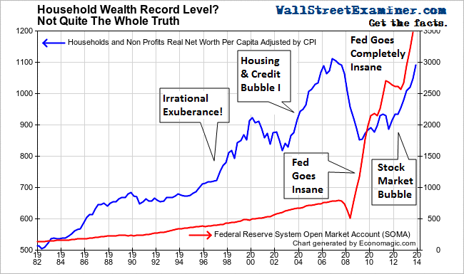
Real Household Net Worth Per Capita – Click to enlarge

I’ve also plotted alongside that line a graph of the Fed’s holdings in its System Open Market Account, which is all of the Fed’s paper holdings that it acquires in trades with Primary Dealers. Prior to 2007, the Fed had steadily grown its holdings at the rate of about 4-5% per year. Household wealth grew at almost double that rate beginning in 1994, prompting Alan Greenspan to proclaim “irrational exuberance” in 1996. Greenspan was particularly concerned that the prices of stocks were growing faster than the Fed’s balance sheet. That was something new. Historically they had grown at more or less the same rate.

The collapse of the internet/tech bubble in 2000-2003 took some of the bloom off the rose as household wealth fell back to the long term trend. Panicked, the Fed sharply lowered interest rates while keeping its asset growth in the 4-5% range. That was sufficient to trigger Housing Bubble I which led to record levels of household wealth per capita in real terms beginning in 2004. That tide peaked in 2006, when the housing bubble crested.

As the Fed scrambled in the early stages of the credit crisis it kept rates low, but withdrew cash from the Primary Dealer system and shrunk its SOMA to fund emergency lending programs in 2007 and most of 2008. The housing bubble crashed and stocks had a big bear market. Household wealth in real terms plunged back to trend. That’s where, like Greenspan before him, Bernanke hit the panic button, opening the floodgates on a massive surge of Fed credit into the financial markets via the Primary Dealers. That initially was followed by a slow recovery in household net worth as the stock market turned sharply and housing prices bottomed in 2009-2011. By late in 2012, both markets were trending sharply higher.

The Fed had a brief return of sanity as it paused QE through most of 2011 and 2012. The housing and stock market recoveries were actually picking up steam during that period. But that was only a temporary remission of the craziness.

Late in 2012 the Fed’s went completely mad. In spite of the fact that both house prices and stocks were in raging bull markets by that point, it opened the money printing floodgates again. This caused extreme distortions in the housing market where prices rose to bubble levels while sales activity remained near record lows. The majority of households were and are in no position to be able to afford buying a house. But prices skyrocketed because there was no supply and absurdly low mortgage rates were subsidizing buyers and inflating prices. It also caused the bubble conditions we see today to develop in stock prices.

The funny thing is that even though few houses are on the market, and even fewer are sold, the Fed and everybody else thinks that we can simply extrapolate the value of all housing based on this tiny sample of sale prices. The media, Wall Street, and the economic establishment all buy in to this ridiculous charade.

Has anyone bothered to stop and think what would happen to prices if a few more people had to sell their houses in the face of the current near record low buyer demand. These prices are fictitious in that regard. By extrapolating those few sale prices to the entire US housing inventory, the Fed creates the illusion of massive amounts of wealth and capital, backed by massive amounts of mortgage debt. It’s imaginary. It’s pure fiction. This is the essence of the fictitious capital nightmare we face. And nobody is paying attention because of the way we think about this data. It’s irrational and insane, but everybody looks at it the same way, just like they did a decade ago.

Don’t think that another collapse can’t happen, because it can. We’re making all the same mistakes, only worse because we should know better by now.

Despite what the headlines say, there’s no new high in net worth per capita, and by extension per household, in spite of all the insane central bank money creation that we’ve seen over the past 5 years. Net worth per capita was still below the 2006 peak level in real terms in the fourth quarter. No doubt that when the first quarter data is in it will be at a record, most likely by a substantial margin given what has already transpired this year. But the questions we must ask are who benefitted, and is it real?

If most people don’t own stocks, or houses in areas that have seen strong appreciation, and if house prices would fall in the presence of an increase in homes for sale to historic norms, then this new high in net worth is an illusion. Increasing wealth at the top of the household wealth strata cannot carry an economy to growth indefinitely. “Wealth” based on a tiny sample of inflated sales prices at record low financing costs cannot be actually liquidated. It isn’t real. If the majority do not experience economic gains and therefore provide a strong and broad base of real demand that can sustain active markets with normal levels of inventory, then the growth of asset prices will once again eventually slam back to trend, and probably worse.

We have seen that three prior surges in household net worth driven by cheap and easy central bank credit have crashed back to earth after about 5 years of extreme bubble gains . The current surge is now in its fifth year. What’s that ticking sound I hear?

Keep track of the insanity of the Fed, Primary Dealers, the US Treasury, other central banks and a whole cast of nefarious characters as they drive markets, in the Wall Street Examiner Professional Edition Fed Report and Treasury update. Try the Professional Edition risk free for 30 days!

Via The Wall Street Examiner » Wall Street Examiner Exclusives. To see the original Click here.

Get the facts. Follow Lee Adler’s chronicling of the insanity of the Fed, Primary Dealers, the US Treasury, other central banks, and a whole cast of market movers in their nefarious market manipulations and interference, in Wall Street Examiner Professional Edition Fed and Treasury reports.

You can check out the Wall Street Examiner Professional Edition service risk free for 30 days.