

Guest Post by Alex Berenson
And have been for six months. This chart may seem unbelievable or impossible, but it’s correct, based on weekly data from the British government.
The brown line represents weekly deaths from all causes of vaccinated people aged 10-59, per 100,000 people.
The blue line represents weekly deaths from all causes of unvaccinated people per 100,000 in the same age range.
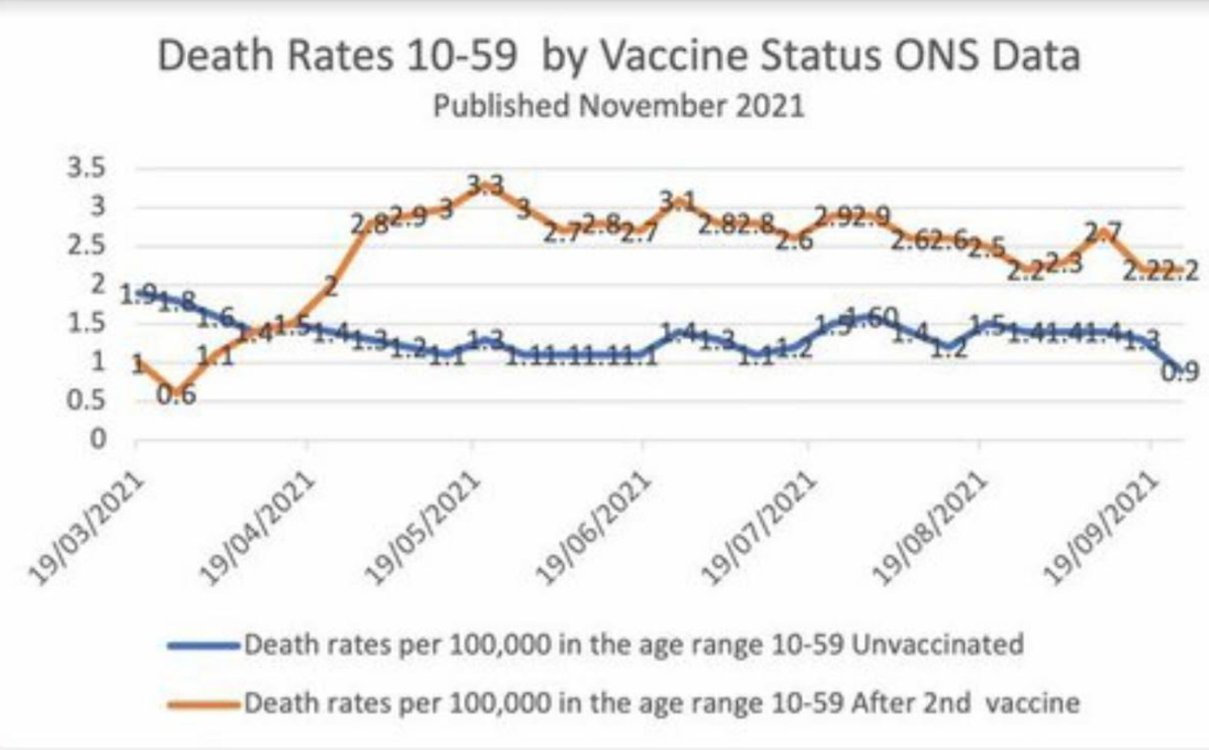
I have checked the underlying dataset myself and this graph is correct. Vaccinated people under 60 are twice as likely to die as unvaccinated people. And overall deaths in Britain are running well above normal.
I don’t know how to explain this other than vaccine-caused mortality.
The basic data is available here, download the Excel file and see table 4:
-----------------------------------------------------
It is my sincere desire to provide readers of this site with the best unbiased information available, and a forum where it can be discussed openly, as our Founders intended. But it is not easy nor inexpensive to do so, especially when those who wish to prevent us from making the truth known, attack us without mercy on all fronts on a daily basis. So each time you visit the site, I would ask that you consider the value that you receive and have received from The Burning Platform and the community of which you are a vital part. I can't do it all alone, and I need your help and support to keep it alive. Please consider contributing an amount commensurate to the value that you receive from this site and community, or even by becoming a sustaining supporter through periodic contributions. [Burning Platform LLC - PO Box 1520 Kulpsville, PA 19443] or Paypal
-----------------------------------------------------
To donate via Stripe, click here.
-----------------------------------------------------
Use promo code ILMF2, and save up to 66% on all MyPillow purchases. (The Burning Platform benefits when you use this promo code.)
Click to visit the TBP Store for Great TBP Merchandise


Alex, please stop with the autistic scribblings, m’kay???
“Does we need big pictures or little pictures???” A picture is worth a thousand words, right???
COVID vaxecutions are going as planned, if much slower than our (((elites))) desire.
Give the follow on “lethal booster injections” enough time, and we’ll have the population numbers down from 8 Billion to 500 million in the next 10 or so years.
Just wait and see!!!
Thanks,
your real (((leaders)))
The Holy See, the Vicar of Christ, is obviously a crypto-jooo.
Jesus was a real jew. Better now?
You broke the Covenant when you rejected His message, and then murdered Him.
No, he’s a Communist
Jesus rode a Harley Davidson.
Those darned Freemasons again.
I’m not sure they’re going slower than the luciferian eugenicsts want.
If they killed people faster, then less people would take the injections. They need to get the injections into as many people as possible before the world is Red Pilled. And the Fourth shot is the Coup de Gras, a lot of people will survive the first three, although becoming increasingly more disabled, but once the fourth shot is given it’s Hasta La Vista baby.
I looked at the original dataset he linked to:
The author didn’t cherry-pick the start date of his chart, but there is no “Second dose” data before March 19th… which kind of makes sense.
?????????
He 100% cherry picked data, “analyzed” the data incorrectly and made some serious fundamental errors when drawing conclusions, it is mind-boggling. If you had a scientific/educational background whatsoever, you would know that. But I won’t criticize you too much, that’s great that you did your best to look into it.
Yes, the data IS from a valid source, and the graph is correct. However, when drawing conclusions, he makes major mistakes. Because, the graph is misleading and cherry picked. THIS, is what it actually looks. He excluded the period where most unvaccinated died, so no wonder there’s not many unvaccinated dying… there are almost none left, they already died during the period they excluded.
The most problematic thing is the title of this blog post, and especially:
Both are very incorrect and misleading, purposefully so I would say.
Trust the science?
Yeah, not this “former journalist”. I debunked it here (See replies).
BLM……Brown Lines Matter?
I guess “flatten the curve” now can be a euphemism for vaccinated flatliners. I’d have a little more sympathy, if the vaccinated weren’t trying to force that death jab into every arm.
What if you look at the whole graph?
Huge protests world wide against covid passports/mandates ect.
The sheep are awakening and perhaps even starting to sharpen their teeth.
I believe we in the US are soon in for a shit show that will go very hot,be glad to be wrong!
In the coming weeks and months these death rates are what need to be examined. However, I read another article earlier today, they were blaming the large spike in deaths in the UK on people not seeking healthcare during the lock downs. Heart issues, advanced cancers etc. So they have their excuse…..in progress
So did the ferrets. And the rabbits. And all the mice. They almost all died and the few that survived were sterile with short life expectancy. Why would the human trials be any different?
We all have the same number of heartbeats. Unless we get ” vaccinated”!
BTW, Congrats on being featured on ZHedge. Nice job all around.
Thanks!
The difference between Rittenhouse and the baaxine is that Kyle’s shots were effective.
Maybe he will write a book and buy a house on Martha’s Vineyard with his advance.
To be exact, the vaxxed have almost a 3x chance of death (2.88) as the purebloods…
I note one of the most prevalent causes of death is undiagnosed ischemic heart disease.
The cause of this is well known, it is a lack of oxygen to the heart caused by a restriction by clot or unusually reducing the intake of oxygen by restricted breathing.
Now I cannot at this moment think of anything in England and elsewhere that would starve the heart of a normal supply of Oxygen, in normal healthy people. It is as if they have been breathing in used carbon dioxide over an extended period. Now Help me here what might cause that ? It is such a Puzzle But I am sure we just follow the science /s
The stupid is so bad it hurts even the dull of mind.
Can’t help you. Just put my mask on and now I’m dizzy. Sorry.
Anon- 5G restricts oxygen, that was a big part of the protest. People get the jab, the 5G restricts the oxygen, the cancers develop rapidly in concert with deranged DNA the body never heals and they will die. Masks are just a bonus for TPTB to limit oxygen further.
You’ve had too much to think
Jesus, that blog post was even worse than this one…
This is 100% fake news.
Just look at the whole graph, and you will realize why most people that died recently are vaccinated:
1. most unvaccinated already died during the period that they excluded when making the graph (purposefully)
2. at this point, most people of risk groups have been vaccinated. So, if they have a higher risk of dying, and they are grouped in “vaccinated”… Well, no surprise to see “vaccinated” having 3 x the deaths as unvaccinated.
This “vox”-site is so freakishly false, I don’t understand how you would ever take someone seriously if they ever claim:
What analysts? I am a student, that have taken a couple of statistics courses at Uni, and I can tell the author on Vox and this “former journalist” have no credibility what-so-ever when it comes to analyse data. Let alone drawing conclusions about it. Drawing correct conclusions based on data is the most difficult thing in statistics (there are other thing too), but to even say:
or
This is proof they have 0 clue what they are talking about. NO real statistician would ever be able to claim these things -EVEN if the data even “pointed at it”. Because, that’s just not how you draw conclusions based on data.
Edit: Oops, apologies. I forgot to link the actual graph. See now why it’s “3 times more”?
Maybe I’m missing something but if 3 people randomly die in 100,000 and 2/3 of the 100,000 are vaccinated won’t the number of vaccinated be twice the unvaccinated? I’m guessing here but I would bet the vaccination rate is around 66% or better in England.
Now it does appear that young people are affected by this vaccine, and I do consider it a death shot, but I’m not sure if this chart proves anything.
Vaccination rate didn’t matter in this graph. You have two different data sets. 1 is deaths/100,000 of those vaccinated. 2 is deaths per 100,000 of those unvaccinated. These are separate not together.
The data this author provided, in table 4, at the bottom, you can read the following:
Good thinking Dan, actually, if this “former journalist” would have any credibility what-so-ever, they would show you the whole graph. So, you were correct: “but I’m not sure if this chart proves anything.” Maybe the whole graph paints a different picture 😉
Getting this out is really tough. The globalists are hell bent on cutting human population 80% to ‘save the planet.’ Don’t believe it? Dig deeper into Bill Gates, Dr. Peter Singer, and any globalist literature. They have the ideal lying combination, a pandemic and BS global warming. They’re overplaying both by a long shot, but their population control may be working.
This data is meaningless people in the vaxed group are a lot older than the unvaxed because the vax was rolled out for older people first. The 12-15 age group only started being vaxed at the end of Sept. As for 10 and 11 year olds they are all in the unvaxed group. Obviously older people die more often and they happen to be more likely to be in the vaxed group.
Under 60 is not old and far below the average life expectancy. The data shows people under 60 both vaxxed and unvaxxed. The data may not be valid if it was comparing those under 60 to those closer to the average life expectancy, but this is not the case. Under 60 for both vaxxed and unvaxxed makes the data valid.
That is ridiculous, there are way more 10yo than 59yo, more 11yo than 58yo etc. As for the age group 12-15 only about 300k have been vaxd most of them in the last few weeks.
The people in the vaxd group average age is way higher than the unvaxd group. The death rate of a 59yo vaxd or unvaxd is way higher than that of a 10yo.
The data is meaningless it is comparing oranges with lemons. It needs to compare similar age groups that are vaxd and unvaxd at the same time.
The question should be why have the government done this? Why are they comparing 10yo unvaxd children with 59yo vaxd adults? What are they trying to hide?
Good points Terry. Not only that, but the literal data sheet this “former journalist” looked at actually explains that the vaccinated population has a higher average age as they were prioritized during vaccine deployment. Hence, why a higher mortality rate is to be expected.
This has fake news written all over it. The conclusion is, “if we exclude the period all the unvaccinated died, then the vaccinated seem to die much more often than the unvaccinated!”
Just take a look at the whole graph… Come on!
Right from the data set itself, footnotes: “For the 10-59 age group, the vaccinated population will on average be older than the unvaccinated population due to age-based prioritisation in the vaccine roll-out. As mortality rates are higher for older people, this will increase the mortality rates for the vaccinated population compared to the unvaccinated population.”
The people getting vaccinated on average are at higher risk of death (older and obese especially) and people not getting vaccinated are typically younger on average and healthier. So the data does show on “Table 3” that the rate of covid related deaths are slightly more than TRIPLE for the unvaccinated vs. the vaccinated in the same age group. Table 4 that has “all cause death rate” which is about 33% higher for the vaccinated group. This difference is slight and expected. The data actually shows just how impressively effective the vaccine actually is.
Haha. Critical thinking isn’t your strong suit.
People who get vaccinated are 3x more likely to die than the unvaccinated and you believe that the vax is safe and effective? HAHA you are delusional. Most people who get vaccinated for the 10-59 age group are healthy so what you say doesn’t make any sense. Also, overall deaths have been increased in all countries the year 2021 compared to the year 2020 and most people have had the second dose. Use your brain!
Jesus… Darren is 100% correct.
Darren, Darren was thinking critically, unlike you 2.
You can see what the WHOLE graph looks like, here.
“Oh wow, after I exclude the period all the unvaccinated died, the vaccinated seem to die much more often than the unvaccinated!”
This is not a serious… blog post by this “former journalist”, it’s a joke. Utter joke, do not take any of what is said in this blog post seriously.
The discrepancy here is simply caused by younger people being much less likely to get vaccinated than older people. This makes the vaccinated group have a large skew towards the older population, which are obviously more likely to die, creating the discrepancy. When you adjust for age, unvaccinated people actually have a slighly higher all-cause mortality rate.
Yup, this is even stated in the excel data sheet that this “former journalist” used. It’s literally at the bottom of the Table 4 sheet.
Hi Alex,
nice work with the graph. I just checked a few datapoints myself and can confirm them.
One question that i asked myself was, what the “by 100.000” mean. On first glance i thought its 100.000 Persons in the cohort, but when I checked the underlying data (thanks for the source) most of the data was per 100.000 Person-Years. A Person-Year should be the time spend in a certain group (Vaccinated or not).
Doesn’t that mean, that the data shown in the graph is not corrected for differing age distribution?
I did a quick check and when using the total Person-Years of each Age group it showed that the average person in the vaccinated group is about 55 years old and the average unvaccinated group is 34 years old.
Therefore, the graph compares two groups which differ in risk-of-death-significant parameters (age).
The sudden growth at about 19/04/2021 could include the effect that many old people got vaccinated which have a higher risk of death in it self and therefore, skews the data towards a higher rate.
Please let me know what you think about this.
Yuuuuup. Not only that, but there’s plenty of cherry picking going on.
“After I exclude the period when all unvaccinated die, during the remaining period, vaccinated people seem to die more than the unvaccinated”. Yeah, no sh*t…
Yet, he says: “I don’t know how to explain this other than vaccine-caused mortality.”
Do not take this “former journalist” seriously, there’s many many flaws in this “analysis” and the conclusions they draw is seriously wrong in science. Period. So, I don’t understand why they would ever “look into the data” if they have no idea of how to do that properly…
Fake news, more about it here
according to the data set you reference the unvaxxed have a significant advantage over the vaxxed, and that is in every moth except males in may 2022
month
Yes I did see that overall in the 10-59 age group it appears to show a disadvantage in taking the vaccine but this is accounted for by the large number of unvaccinated in the lower age groups which means that is not comparing like with like as there are very few deaths in those age groups whether vaxxed or unvaxxed. I have analysed the data for the 20-59 age group and it shows a death rate of 171/100,000 for the unvaxxed and 151/100,000 for the vaxxed. Also if you look at each age cohort there is an advantage that increases with age at least up to 60 in having the vaxxine, so that for someone over 40 there is a significant advantage in have the vaxxine. In all this analysis I have used the figures for having two or more doses and the all cause mortality. I looked primarily at table four and table six