

Guest Post by Steve Kirsch
Professor Morris wrote an article that has two tables showing that the death rate after vaccination is not flat. More confirmation that the vaccines are causing huge numbers of excess deaths.
Executive Summary
Data in two charts in UPenn Professor Jeffrey Morris’s article show clearly that the vaccines are causing excess deaths. The shot goes in and the death rate starts climbing. Do it again… shot goes in, death rate starts going up, but this time by a smaller amount. That’s dose dependenc! If the vaccine is perfectly safe, nothing should happen to the death rate on each dose: it should be virtually identical.
This means that the VAERS spikes in deaths are not from “overreporting” as the CDC and Professor Morris have erroneously claimed: these are real excess deaths.
These people need to get out of their ivory tower and talk to real doctors who are being inundated with injuries and deaths. The data we observe doesn’t support the claims that the vaccines are safe and it is just “overreporting.”
Why would everyone instantly decide to overreport just the COVID vaccine and not any other vaccine? Nobody ever explains that and provides evidence. I show that the evidence shows that the COVID vaccines are actually 5X underreported!
In this article, I will explain what the data that Morris highlighted shows and also address each of Morris’s attacks on this article.
Introduction
Check out this article written by UPenn Professor Jeffrey Morris. His specialty is biostatistics, but in his spare time, he writes articles trying to debunk my work and the work of others who attempt to spread the truth.
His article contains a hidden gift to me that he never noticed.
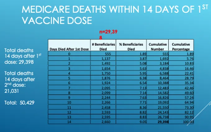
Check out these two charts below and look at the column where the red marking is. See how the numbers go up? … and up? … and up? This column is the daily number of deaths.

Key point:
If vaccination is a non-event, all the numbers in this column should be roughly the same since death is a random event.
Instead, the death numbers per day are pretty much monotonically increasing over time (with one exception in the second chart). For example, on Day 1, we have 1,137 deaths but on day 14, we have 2,660 deaths. That’s a factor of 2.3X growth in just 14 days!!! That’s a HUGE increase. Morris never explain how that can happen in a safe vaccine.
Morris never noticed that the deaths start rising right after the shot because he’s paid not to see any data that goes against the government narrative. It’s clear to all my subscribers, but Jeffrey doesn’t see it at all. The pattern is hard to explain if the vaccines are safe.
What’s worse is the fact that you can replicate the exact same pattern when you repeat the intervention (Dose 2). The second time, the numbers don’t go up as much suggesting that the effect is dose dependent (which is a sure fire sign of causality).
What is going on here?
There are really only two possible explanations for this data. Either:
- The vaccine is INSTANTLY reducing your risk of death from all causes by a factor of two, and then the effect wanes over time and returns to “normal” at around 14 days.
OR - The vaccine has a kill pattern that is progressively increasing and peaks sometime after day 14 and then drops back to normal (before going up again later for a second peak at 5 months out as I point out in this article).
To resolve which one is true, have more data from Renz’s original presentation, notably:
So the death rate peaks at 17 days out and then falls back to the baseline all-cause mortality rate. You can see the 2X peak in this chart as well (from 150 baseline to 300).
So unless Professor Morris can provide an alternate explanation for the monotonic increase in deaths that correlates EACH TIME there is a shot with the timing of the shot, we should assume it is the shot causing the increase.
He sent me a rebuttal but he avoided explaining how the deaths go up, peak, and then go back down to normal. A convenient omission.
Professor Morris should be immediately calling for a halt to the vaccine shots if he were an honest scientist. He isn’t doing that because (just between me and you) he’s not an honest guy and refuses to engage in a recorded discussion. That’s just the way it is.
Why the CDC never released any of this data to the public
The CDC never released the CMS or SSA data because the CDC would have too hard a time explaining it, so they keep it hidden from public view since their job is to protect the public from any information that would cause vaccine hesitancy.
Conversely, I was keen to publish it because my job is to expose corruption and the truth because that’s what “misinformation superspreaders” are supposed to do.
The one question Professor Jeffrey Morris and Dr. David Gorski refuse to answer
I asked both of them to either validate or invalidate my article on the “death” safety signal that fired and the CDC never noticed.
Both refused to do it. It’s a simple calculation. I know that because before I asked them, I gave it to two statisticians and they both validated my work without a problem. I asked a third guy, William Briggs, to do the calculation as well. He said, “Why bother? It’s obvious that the criteria was met.”
Check out Briggs’ articles on how stupid masks are, especially his article on the highly acclaimed Bangladesh mask study. Briggs nailed it. I was so impressed I sent him $100 about a year ago when I first read his work.
But Professor Jeffrey Morris on masks? Here’s the misinformation he’s spreading that is not backed by science:
Masks should not be a big deal. Ample data and common sense suggest that masks (especially N95 or surgical masks) “help some” in reducing risk of exposure and transmission when properly worn, especially in crowded, enclosed indoor settings during times of high community infection levels. People should be encouraged to wear masks in such settings.
Yeah right. No way is that true as Briggs and I have pointed out.
Also, I asked Briggs about debates. I told him that Professor Morris told me that real scientists don’t debate, that they just publish papers in the literature to resolve differences or send written documents back and forth.
Briggs said that debate is how science advances and that he personally has never backed down from a debate challenge, but nobody wants to debate him. I wonder why? 😉 Hint: read some of his articles and you quickly understand.
Both of these guys (Morris and Gorski) refuse to validate my work or engage in a debate. Even when I offered “name your price” compensation for their time.
That pretty much tells you everything you need to know about how confident these people are in their beliefs.
Attacking this article
Peter Yim wrote that there could be a healthy patient bias in that people who are healthier are more likely to be vaccinated. But this is a self-controlled case series because all the participants in the statistics are “healthy” since they all were vaccinated. We are simply looking at when they die relative to the shot. Also, one could also argue that people who were sicker would be more likely to rush to get the shot to protect them from dying which would be the reverse bias. But again, since there is no comparison group, there is no bias here: we are simply looking at a response curve of a single group over time, not comparing two cohorts.
As far as the “correlation isn’t causation” argument goes, we have all the elements here to satisfy the Bradford-Hill causality criteria. But if you don’t believe it was caused by the vaccine, then you need to explain what else could have caused the effect.
Morris’s attacks
He claimed that I:
- Neglected the “healthy vaccinee effect” where the risk of death is lower when first vaccinated because people about to die are typically not given shots at that time.
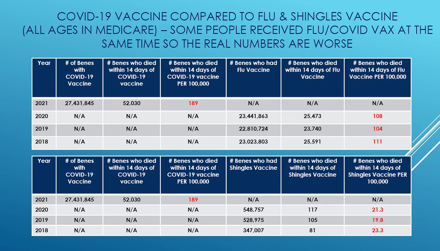
- Failed to explain that the rates of death over 14 days for the COVID vaccine were the same as the flu vaccine. He claims this proves that the differences in VAERS is thus all due to overreporting.
I will respond to both of these arguments:
- Sure, people who are about to die typically don’t get vaccinated. We are left with people where we have no idea when they will die. It’s a Poisson distribution so it’s totally random on any day. In other words, when you are limiting yourself to healthy people, those healthy people die at a completely random rate (that is somewhat dependent on seasonality). Where the “healthy vaccinee effect” would come in is where you are doing a study comparing a vaccinated group with a comparison group such as in this paper. Because we aren’t comparing two cohorts, the bias doesn’t apply.
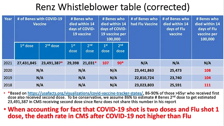
- Morris says that over 14 days, the same number of people die after the COVID vaccine (say shot #1) as from the flu vaccine when you track all the deaths. Therefore, the COVID vaccine is no more dangerous than the flu vaccine. There were 1.17 more people who got the COVID vaccine in the presentation, and there were 29.7K deaths vs. 25.4K deaths (flu in 2020). 29.7/25.4=1.17 suggesting that the death rate is exactly the same for both vaccines. In short, it appears that all the deaths for both are simply “background all-cause mortality death rates” and there is absolutely nothing to see here and both the vaccines are perfectly safe.
Point #2 is where Morris plants his flag. He would claim that this is unassailable proof he’s right. Can you spot the flaw in his argument? Most people wouldn’t be able to so he claims victory. This is why he hates debates. He likes writing one-sided pieces where the other party isn’t around to rebut what was just said.
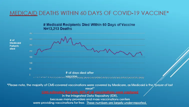
One possible explanation is in the text in red in the Medicaid slide above. It says, “CMS estimates that only 48% of all vaccinations were captured.” What happened is that people got vaccinated outside of the CMS system because vaccines were free. So when people went to the pharmacy to get their shots, there was no reason at all to make a record in the Medicare system since the shot was free. So these shots never got recorded in the Medicare database. These people looked “unvaccinated” in the Medicare system so there were half as many deaths that would be tracked by a query like “died 14 days after the shot.”
Slide 21 is going to provide us some more insight into this. It basically shows we’ve only vaccinated 42.8% of the 64M people in Medicare. So more than half were vaccinated outside the system and weren’t counted in the numbers.
So now we get up to being able to explain the 86% (or more) vaccinated. But we still have the problem of it looking like all background deaths for the total per capita death rate.
So to recap, the death rate from COVID Dose 1 in 2021 is the same death rate from the flu vaccine in 2020 on a per capita basis. So it looks like Jeffrey is right, doesn’t it? It seems like for both vaccines we are just tracking the background death rate… nothing to see here.
But of course, he’s not right. Do you see why? It’s pretty subtle. Stop reading here if you want to solve this yourself. Otherwise, continue reading below this slide (from Jeffrey’s presentation) and I’ll explain the mystery.
OK, there are four counterpoints to Jeffrey’s argument:
- Dose 1 vs. Dose 2 rates shows it isn’t just background
- The spike in Slide 29 shows it isn’t just background
- Shingles rates (of 20) suggest the background death rate could be much lower than 90 in 2021.
- The 10X death rate difference between the two vaccines in younger people shows that the COVID vaccines are not nearly benign as Morris claims. You can’t explain such a large difference if both vaccines are benign.
Let’s talk about each of these points in detail.
If the vaccines are all safe, the number of deaths within 14 days of vaccination will be the same regardless of the vaccine used since it will be just the background death rate. There will be slight age confounding for the shingles vaccine (since it might be biased to younger Medicare recipients) but it shouldn’t be that much. For the flu vaccine, we shouldn’t expect much age confounding since everyone will get it just like the COVID vaccine.
Fewer people got Dose 2 and there are fewer deaths. But look at the per capita death rate difference between the doses: 20%. Whoa! If this is all “background death rate” as Morris claims, the two numbers (107 and 90) in the table above should be nearly the same. They aren’t!! So Dose 1 was 20% deadlier than Dose 2. And that suggests that Dose 2 probably wasn’t completely benign either and might be 20% elevated vs. background death rate for 2021. We don’t have flu data for 2021 so there is no comparison to know the background death rate! It sure looks like there are excess deaths happening here.
We also have confirmation of the killing effect in the curve also in Slide 29 above as well. Background deaths wouldn’t have a peak like that. It would be completely flat (with some noise of course).
The shingles per capita death rate is around 20. This suggests this could be the true background death rate for this population. But the Shingles vaccine is likely given to younger Medicare patients so this could explain the lower background death rate. Still, this does warrant some further investigation.

Renz’s Slide 33 is the icing on the cake:
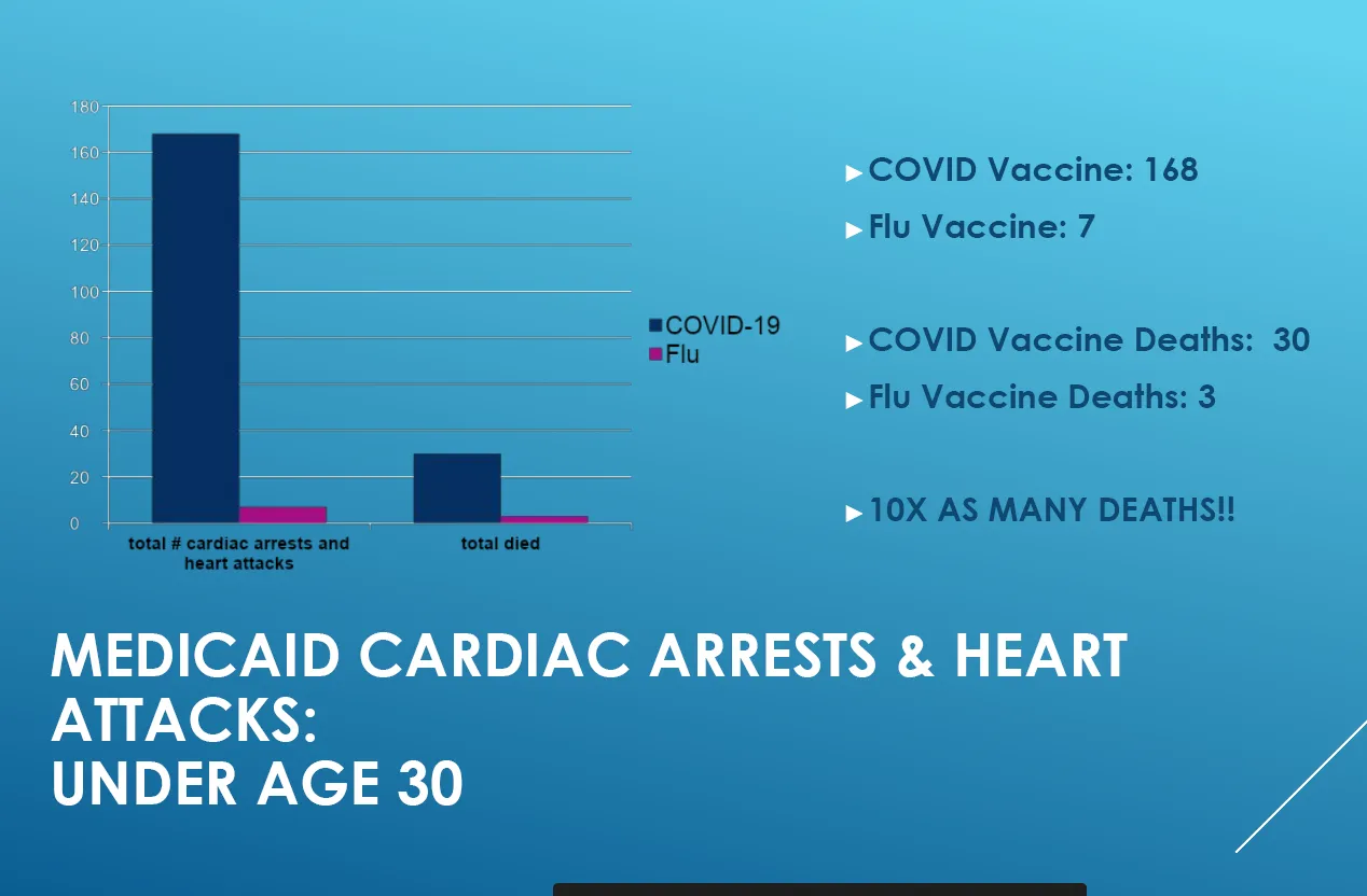
If the COVID vaccine is perfectly safe and killing nobody, then how can Morris explain the 10X difference in deaths under 30 between the two vaccines (since the # of people tracked is about the same). And there is a 24X factor difference for non-fatal cardiac issues. That doesn’t feel like a safe vaccine to me.
And of course there are many other “hard to explain” things like this paper from Nature (note that what is disputed is the conclusion and NOT the data!).
At this point, Jeffrey is going to want to change the topics and avoid discussing this evidence.
BONUS gift from me to you: The raw data from the social security death master file showing the peak in deaths 5 months after the peak in vaccination
Note: this section of my article is just to let you know about another dataset: the social security death master file.
Here is the original dataset that I used in my 5 month delay in the death peak article: Social security death master file data
The description of the database can be found in the first file (SSA Death Master File Pct Increase Deaths 2020 to 2021) in the tab labeled “What is DMF.”
Have fun with it. You can impress your friends. You don’t need it to understand this article, but I didn’t want to write a separate article just to let you know about it. This is another peak Jeffrey would have a tough time explaining as it happens all over the world as I noted in my article.
Jeffrey Morris will never be able to explain this data
And finally, check out this 2 minute trailer from “Died Suddenly” which is a new documentary produced by Stew Peters that will stream on November 21:

Let me be perfectly clear:
Jeffrey Morris cannot explain what is in that 2 minute trailer above. If he can, I’ll be very impressed. He has to ignore it. He ignores data he doesn’t like. Here’s the Epoch Times article with more details.
Here’s the official 4 minute trailer of “Died Suddenly” which talks about the clots. Again, those “clots” are hard to explain any other way. Jeffrey is at a loss to explain this as well. Also, I’m pretty sure you’ll see a familiar face or two in this trailer (like mine):

Summary
Professor Jeffrey Morris has inadvertently highlighted data for us that the death curve after COVID vaccination is NOT flat like it would be for a saline shot. This cannot be explained any way other than that the COVID vaccines are killing massive numbers of people.
Morris should also explain why over 300,000 people joined the “died suddenly group” on Facebook, mostly to tell their unique story of what happened to a loved one. That’s not a symptom of an “overreporting problem.” This is unprecedented.
All of these “sudden deaths” in plain sight are not an “overreporting problem.”
They are a symptom of a massively unsafe vaccine.
But UPenn professors cannot acknowledge this data because they do not consider such evidence to be “scientific.”
Sorry, science is about explaining all the data. You don’t get to ignore the evidence you don’t like, if you are a real scientist.
It is my sincere desire to provide readers of this site with the best unbiased information available, and a forum where it can be discussed openly, as our Founders intended. But it is not easy nor inexpensive to do so, especially when those who wish to prevent us from making the truth known, attack us without mercy on all fronts on a daily basis. So each time you visit the site, I would ask that you consider the value that you receive and have received from The Burning Platform and the community of which you are a vital part. I can't do it all alone, and I need your help and support to keep it alive. Please consider contributing an amount commensurate to the value that you receive from this site and community, or even by becoming a sustaining supporter through periodic contributions. [Burning Platform LLC - PO Box 1520 Kulpsville, PA 19443] or Paypal
-----------------------------------------------------
To donate via Stripe, click here.
-----------------------------------------------------
Use promo code ILMF2, and save up to 66% on all MyPillow purchases. (The Burning Platform benefits when you use this promo code.)


Massacre of the Innocents: CDC Inflicts Biowar Vax on Children

Ancient ritual of child sacrifice lives on
https://www.unz.com/kbarrett/massacre-of-the-innocents-cdc-inflicts-biowar-vax-on-children/
Lawyers ready to SUE any state that tries to force school children to get “vaccinated” for covid
https://www.naturalnews.com/2022-10-27-lawyers-sue-states-force-school-covid-vaccines.html#
Since Kirsch is like a dog with a bone on this issue, I hope he’s reading the Ethical Skeptic’s latest piece (10/24/22) on the CDC fudging death data.
Also on Kirsch, might have to file him under I Know A Good (((One))).
From the first announcement that everyone must get vaccinated with these mRNA concoctions I start asking questions and never got intelligent satisfactory answers .
I heard it’s safe & effective , you won’t be able to go anywhere or do anything .
You will be a bad person blah blah !
Then I watched one after another get vaxxed get boosted get sick and injured for life .
I live immune suppressed due to a life saving kidney transplant because of PKD a genetic issue that destroys kidney function around your 50 year mark some sooner some later !
So I’m cautious regarding all medications!
Knowing most of what Government experts tell us is a load of shit ! I followed the advice of George Carlin
“I never believe anything my government tells me NOTHING!”
Looks like I followed good advice !