

Guest Post by The Northman Trader

I got a freak chart for you that’s stunning, but bear with me here because it requires some background and patience. Most of us are focused on the daily or weekly action and it’s easy to lose sight of big cyclical trends. We don’t think of them as they take a long time to unfold and the daily noise is so much more dominant.
With the advent of permanent central bank intervention sparked by the financial crisis all of us have come accustomed to markets always going up with the occasional correction in between and the timing of corrections have seemingly become shorter and shorter. Big fat bottoms that happen after just a few days of temporary terror. We haven’t seen a true bear market since the financial crisis and even that one lasted barely more than a year as central banks stepped in. The last longer term bear market came after the technology bust in 2000 when markets bottomed in 2002 and 2003 and then proceeded onto the next bull market.
It didn’t always used to be this way. Going back to 1900 there were multiple extended periods of stock markets going nowhere and trading in wide chop ranges:

One could even argue that the period between 2000 and 2012 was such a period before markets finally broke above their 2007 highs.
| With global tensions spiking, thousands of Americans are moving their IRA or 401(k) into an IRA backed by physical gold. Now, thanks to a little-known IRS Tax Law, you can too. Learn how with a free info kit on gold from Birch Gold Group. It reveals how physical precious metals can protect your savings, and how to open a Gold IRA. Click here to get your free Info Kit on Gold. |
But looking at this very long term chart we can note consolidation periods that were much longer, most notable the period between the 1960’s and the early 1980’s. No progress whatsoever, but then something happened and the answer should be obvious: The advent of personal computing, the internet and information technology. It changed everything and accelerated the world to never before seen wonders. But it also has come at a cost and we may be seeing the effects of this cost unfold in front of our eyes.
View it from a big macro perspective: Central banks have done their best to lead a global economy back to organic growth coming out of the financial crisis. The promise was full employment and inflation back to 2%. If you look at the official statistics they’ve met their unemployment goal, but they kept missing on the inflation front. Why? Because they are fighting the greatest deflationary force known to man: Technology. Companies like Facebook and Netflix have stamped out massive audience businesses requiring few people to serve them. The scalability of technology is incredible. Hence the economic model has changed and it’s all a bit inefficient for the many, but highly effective for the few. It is no accident that wealth inequality has expanded to the extreme degrees we witness today. It’s no accident that the tech titans are the richest people running around the planet. And given central banks’ desperate actions to ward off these deflationary forces they’ve enabled not only the renewed acceleration of asset bubbles again benefitting the very few, but they’ve also encouraged the taking on of unprecedented government and corporate debt and BBB rated junk debt in the process.
And now it gets interesting. In 2018 we witnessed a global blow-off top following 10 years of central bank intervention and following the US tax cut. Peak artificial liquidity. Global central bank balance sheets peaked in January 2018.
Where did the $DJIA stop? Not at some arbitrary point. No sir, it stopped at a very particular point, a point only a freak chart can suggest.
As many of you know I’m a big fan of trend lines and here it is, the freak chart:
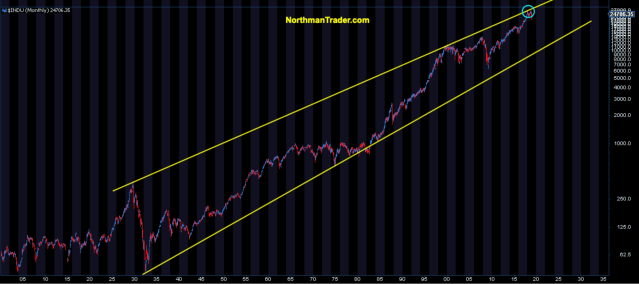
1929 top, 2000 top, 2018 top (if 2018 is a top), but there is little denying the obvious: The $DJIA stopped twice in 2018 at a trend line that dates back to the starting points of 2 major crashes. 1929, and the 2000 technology crash.
The consequences? Immediate doom and gloom? I can’t say, what I can say is that this trend line has been massively relevant and is very much confirmed. Some may dismiss it as a fluke of course, but that would be a hell of a fluke.
Note there is a lower trend line there. This lower trend line has been left in the dustbin of history, untouched since the advent of the technology boom. The world has changed greatly since the 1980s, but the ghosts of historic debt expansion and slowing growth are all around us. If we can’t see massive organic growth with the largest artificial liquidity injection in human history what will it take? I have to ask.
What if it took all this artificial liquidity to barely squeak out 2% growth? That spike in GDP growth in the US last year? Looks very much temporary as the effects of the tax cut barely lasted 9 months.
Here’s the latest global growth forecast by the IMF:

2020 starts in less than 12 months and look at those far right columns.
Nobody wants to predict a recession of course, but these numbers are skirting awfully close to a recession.
1.3% GDP growth for Germany in 2019? 0.5% GDP growth for Japan in 2020? All these places still have negative rates and/or full intervention. US sub 2% in 2020 while the country is running trillion dollar deficits?
That’s the grand result of 10 years of artificial liquidity injections?
What if that’s the best this new economic reality could achieve under the structural circumstances? What if the technology growth boom is petering out? What’s $AAPL’s next big path to growth? Another iPhone version? Hardly.
No, it may just be that slowing growth globally will force the world to come to terms with the largest debt expansion in history and perhaps all of a sudden all that BBB rated junk debt will become very relevant very quickly:

Who is to say? I suggest nobody knows because the world has never before been in these circumstances.
But if things do indeed turn sour than our freak chart has some potential technical destinations to consider:

I’ve added some fibs to this long term chart and adding to the intrigue is the fact that these fibs line up with major previous market pivot points. Perhaps that’s just another fluke, but is it so unreasonable to presume that a 10 year record liquidity injection and record debt expansion has perhaps caused asset prices to overshoot? Just reversing back to the 2015/2016 area would constitute a .382 fib retrace. A 50% retrace would bring $DJIA back to the 2007 highs. A .618 fib retrace would bring $DJIA back to the 2011 lows and perhaps tag the lower trend line, timing dependent.
In context of a 90 year chart is such a technical retrace to the lows of just 8 years ago unreasonable? I have to ask.
Especially if you realize that 61.8% of the gains in that 90 year $DJIA chart have come in just the last 8 years. ?
Ponder that.
With global tensions spiking, thousands of Americans are moving their IRA or 401(k) into an IRA backed by physical gold. Now, thanks to a little-known IRS Tax Law, you can too. Learn how with a free info kit on gold from Birch Gold Group. It reveals how physical precious metals can protect your savings, and how to open a Gold IRA. Click here to get your free Info Kit on Gold.
It is my sincere desire to provide readers of this site with the best unbiased information available, and a forum where it can be discussed openly, as our Founders intended. But it is not easy nor inexpensive to do so, especially when those who wish to prevent us from making the truth known, attack us without mercy on all fronts on a daily basis. So each time you visit the site, I would ask that you consider the value that you receive and have received from The Burning Platform and the community of which you are a vital part. I can't do it all alone, and I need your help and support to keep it alive. Please consider contributing an amount commensurate to the value that you receive from this site and community, or even by becoming a sustaining supporter through periodic contributions. [Burning Platform LLC - PO Box 1520 Kulpsville, PA 19443] or Paypal
-----------------------------------------------------
To donate via Stripe, click here.
-----------------------------------------------------
Use promo code ILMF2, and save up to 66% on all MyPillow purchases. (The Burning Platform benefits when you use this promo code.)


We’ve pulled growth forward by excessive currency expansion to offset the decline in energy available from oil. It’s a massive price we’re gonna pay.
How exactly has the energy available from oil declined?
Did somebody water it down?
Did they cut it with baby laxative?
Please explain.
Assuming you are just ignorant and not being snarky.
“The energy available from oil” = Net Energy Return on Energy Invested. It takes much more energy to get the oil now than in the past, so his statement is factually correct. Economic growth depends on ‘excess’ or ‘net’ energy after all energetic inputs are accounted for to get that energy source and make it available for productive work.
This is the crux of the ‘peak oil’ concept. You get very little net energy from oil sands after mining, cooking, transporting and cracking into usable petroleum products compared to the light-sweet crude that we have mostly used up.
Thanks Peaknic. Unfortunately Mr.22 doesn’t understand oil and it’s effect on the economy.
EROEI. Each barrel is more expensive to extract than the last, in energy terms ( which are the only terms that matter). Soon, a barrel of oil will take more energy to extract than the energy in the barrel itself. This is already the case with some (many?) fracking “plays”.
Energy is NOT the only term that matters. That it takes near the energy to extract a cf of gas, than exists in that cf of gas is simply false … factually, physically, false. Likewise a barrel of oil.
Fracking plays are played out because it is more expensive to extract than it would return in revenue — i.e., money.
This is known as the law of supply and demand.
In the long term, peak oil production in the U.S. occurred because the marginal cost of extraction in the U.S. was more than the marginal cost of extraction in Saudi Arabia plus the costs of transportation and refining.
In the short term, peak oil occurred when, and how, it did because supply overshot demand (just as occurred with natural gas in the U.S. earlier this decade – though the price has recently peaked at near 2014 levels).
Your comment is just a tad early since shale oil is on the verge of a crash.
what does that mean?
More finance.
Less doom porn.
Less Eric Peters Auto.
Less pro-big government, fake-upon-scrutiny, conservative authors.
I disagree with your first three points. I hate finance. I like Eric Peters. And Doom Porn is the only reason I still bother with the internet at all.
Up up and away. Forever and ever!!!
Buy the dip!
With a crash, people won’t have jobs to drive to. So it will all balance out.