Guest Post by Steve Kirsch
A first analysis of the NZ record-level data
Not long ago Steve called me and said that had some real unaltered vaccination records and wanted me to see what they revealed about vaccine safety. Here’s my take on it. There’s so much more to dig in here, but I leave that as an exercise to the reader. Steve has made the data public here.
Turns out the vaccine increases death rates in the first 6 months after the shot which persists for about a year before going back to baseline. And it’s the last dose that kills you – pulling forward death into that first year post shot.
Let’s start with death rate. Here we see the number of deaths per 100,000 person days after the last shot. More on that metric later, but it’s the least biased way we can look at the data we have. The blue line is from the vaccine records, the red is from some synthetic data I created that was explicitly designed to NOT have any vaccine effects (more on that below, too).
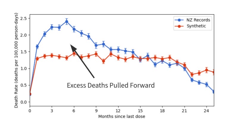
I don’t know about you, but I clearly see a peak in death rate about 6-months out from the last shot and that stays elevated above baseline (the red) for about a year.
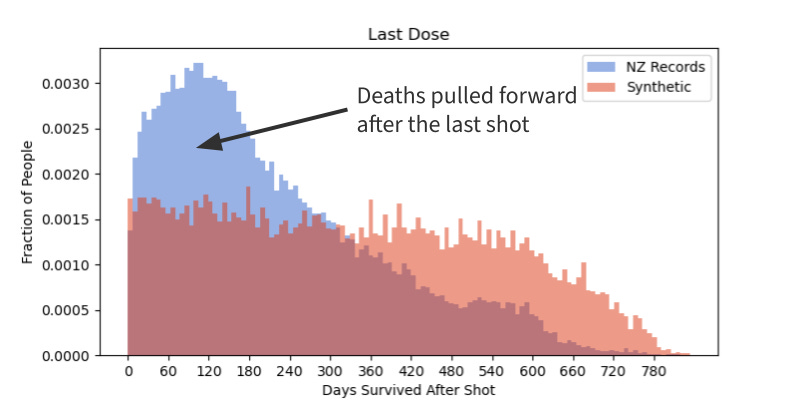
Another way to look at the data: let’s just look at the people who died and see how long they survived after their last shot. I tend think in probability density, so that’s what I have here (I labelled it “Fraction of People”, but for those in-the-know, it’s probability density, the area under the curve is 1).
If the vaccine didn’t cause death, then I’d expect to see what the red data shows, a constant death rate (with Poisson noise) after the last shot. But that’s not what we see, the deaths show up with a 6-month-ish peak and stay elevated for about a year.
What about age stratification? What about vaccine batch? What about dose count and timing? Yeah, that’s all in the data, slice and dice and see what you find. I wanted to get the big picture and see if there’s signal. If that’s not a clear signal, then I don’t know what to tell you. Have at the data, it’s here.
Ok, nerd stuff follows below.
What is the data?
We have “record-level data”. Which is an entry in the data for every vaccination a person received with the date and dose number they received it and death date if that happened. I think this is the first time we have true unaggregated records that allow us to do real correlations.
It’s not perfect, though. We only have vaccinated people in this data, so we can’t get a true unvaccinated death rate over the same time frame. From what I gather, people end up in one of three data sets and we only have one of them here, so we don’t have everyone’s visits – practically that means it often looks like someone skipped a dose because that dose may have been recorded elsewhere. So we have to be creative to analyze the data because it can be very easy to find a survivorship bias or other anomalies since we are only looking at a subset of people (those who were vaccinated and died in the time frame we have and also at a facility that was reporting to this data set).
What’s the deal with the synthetic data in these plots?
I get squeamish when statisticians talk about all the weird controls and things they do with data, so I wanted to try another way to make sense of this data. I’m a computational modeler, what I try to do is create models that describe the natural world and use that to gain understanding (of course, all models are wrong, some are useful). So rather than go through all kinds of gyrations to account for any of the reporting bias that may show up in the data, I decided to create synthetic (fancy word for made-up) data that 1) is guaranteed to not have any vaccine effects in it and 2) would have the same reporting bias as the real data. The only difference between the real data and the synthetic data is the effect of vaccination.
Let’s look at the constraints in the real data: a person only shows up in the records after their first (recorded) vaccination. That means even a constant death rate (just people randomly dying) will appear in the data as an increasing death rate because more people are entering the records as they get their first vaccination. We also only have people who died after a vaccine – they wouldn’t be in the data set if they died before getting a vaccine. Since the data set stops at some time, we also don’t have people who might have died after the data set was sent to us. And as people die near the end of the reporting period the death counts go to zero since we’re running out of people.
That all sounds obvious, but it can cause weird effects. So I needed to create data that behaves the same as the real data except that I can ensure that it doesn’t have any vaccine effects. The vaccine in my synthetic data is 100% safe. Here’s how I do it:
In the real data, we have about 1000 days and about 2% of the people die, which means that on any given day each person has a 0.002% chance of dying (yes, I did the probability correctly in the code, this is just an approximation here).
In the real data, we know the days that every vaccination happened. That is, we know when people got dose 1, dose 2, dose 3, and so on.
I can simulate people going through those 1000 days. For each person and each day, I roll the dice and decide if they die, if they get vaccinated, and with which dose.
Death occurs at a uniform probability of (approximately) 0.002% each day. In fact, we roll the death dice before the vaccination dice so that the vaccine cannot cause death in this simulation.
Vaccination occurs at the rate defined in empirical PDF from the real data. If the vaccination dice say they were vaccinated after they died, then they don’t enter the data set, just like in our real data – if someone dies before their first vaccine, we don’t know about them.
We record vaccination dates and death dates and create a parallel datafile that looks like the real data, but we guarantee that this data has a placebo vaccine that doesn’t cause death.
Repeat for 1,000,000 people and we have synthetic data.
Ok, sounds fancy, is it correct?
I sure hope so! Synthetic data has been a staple of my research for years. Let’s step through it so you believe me. Here’s the probability for the number of doses that each person received. The blue and red overlap nearly perfect (it should: 1,000,000 records will have very very small sampling noise).
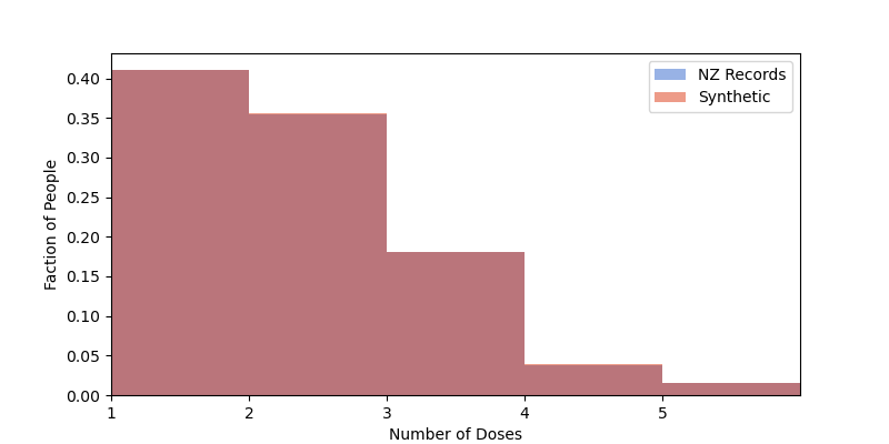
About 40% of the people got 1 dose, 35% 2 doses, less than 20% 3 doses, and so on. The distributions are the same in the data and the synthetic data.
Ok, how about when they got their shots? Here’s the PDF of that. My epoch starts at 1-Apr-2021 just before the first record in the data. We can see the dose 1 and 2 doses for the initial vaccine rollout in the spring of 2021. Synthetic shots happen at the same rate as the real data
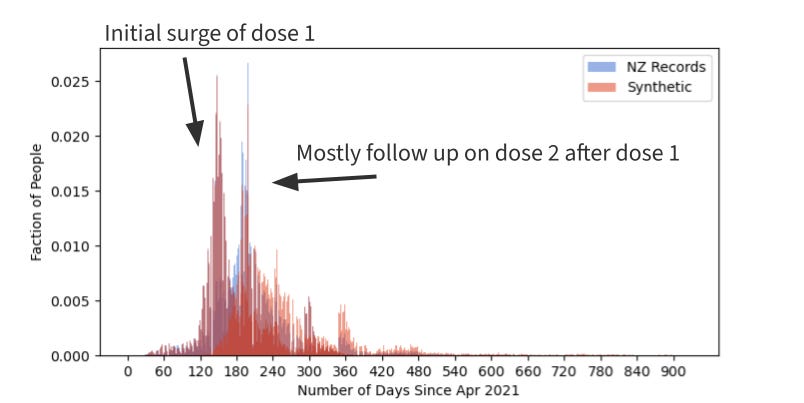
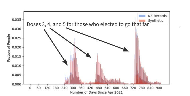
And I also simulated shots 3, 4, and 5. Plotted here because they wouldn’t show up on the scale above.
And when did people die?
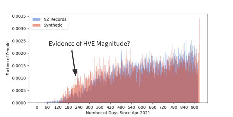
We see a few things here – and this is really why I had to create synthetic data. That death rate sure doesn’t look constant. What’s going on there? The rate is constant for everyone, but unvaccinated people aren’t in the data early on. The data set starts for each person when they were first vaccinated. So as people enter the data set they have a constant probability of dying each day, and as more people enter the data the more people start to be recorded as dying.
Without having this insight, one may be tempted to just look at the increasing death rate of the real data and say, “sure that looks like vaccine-induced death”. But much of that is an artifact of how the data was collected. It’s the difference between blue and red that is the effect of the vaccine.
What do we notice? Between days 60-120, I see some blue deaths that aren’t occurring in the red. Is that the vaccine pulling forward the deaths?
Near days 240, the red has a boost above the blue, is that evidence of the healthy vaccine effect? Maybe? I didn’t check that, but it’s plausible.
What’s the actual analysis?
Once I have the records, I can march through time and put people in buckets and then use those buckets to determine the death rates. I originally felt uncomfortable with this approach when I first saw it with the UK NHS data, but it does make sense. I have a list of 1,000,000 people and I start the clock on 1-Apr-2020. On each day I put people in one of these buckets:
Unvaccinated
less than 1 week out from dose 1
1-2 weeks out from dose 1
2-3 weeks out from dose 1
…
less than 1 week out from dose 2
1-2 weeks out from dose 2
2-3 weeks out from dose 2
… and so on
A person will be counted each day they’re in that bucket. If they get another dose, they will be counted in the new bucket.
So the buckets get big! A person who survives a week will be counted 7 times, and we have 1,000,000 people.
When someone dies, we look at the last bucket they were in and record a death in that bucket and then they are removed from further analysis. So we can now report a rate which is deaths per person-day. The nice thing about that is that’s it’s self-normalized and as people get more doses and move from bucket to bucket, the stats stay the same.
Going all the way back to Fig. 1. We can then plot the death rates in terms of which bucket people were when the died. The blue curve keeps climbing for 6 months post shot before it starts coming down. The red curve is constant because the only source of death in the synthetic data is a roll of the dice. The difference between the blue and the red has to be attributed to the vaccine and not reporting bias.
My favorite plot is Fig. 2. I know there can be some issues because this is only considering dead people, but the synthetic data can also help normalize for that. I think this one very clearly shows that people die sooner post vaccine. The red bars are flat (plus Poisson noise), that’s what you’d expect to see if the vaccine were a placebo, but we see blue way above red early on because the vaccine is pulling deaths forward. It falls below red because we’re running out of people (as people die and no new people enter the data set eventually the death count gets to 0 at the end).
If the vaccine were safe blue would match red. If the vaccine were effective, blue would be below red because it’s keeping people from dying.
Aren’t you just a crazy antivaxxer?
Maybe, see for yourself. Get the data here, look at it with your tools. Party on.
It is my sincere desire to provide readers of this site with the best unbiased information available, and a forum where it can be discussed openly, as our Founders intended. But it is not easy nor inexpensive to do so, especially when those who wish to prevent us from making the truth known, attack us without mercy on all fronts on a daily basis. So each time you visit the site, I would ask that you consider the value that you receive and have received from The Burning Platform and the community of which you are a vital part. I can't do it all alone, and I need your help and support to keep it alive. Please consider contributing an amount commensurate to the value that you receive from this site and community, or even by becoming a sustaining supporter through periodic contributions. [Burning Platform LLC - PO Box 1520 Kulpsville, PA 19443] or Paypal
-----------------------------------------------------
To donate via Stripe, click here.
-----------------------------------------------------
Use promo code ILMF2, and save up to 66% on all MyPillow purchases. (The Burning Platform benefits when you use this promo code.)



Thank you, Barry Young.
Whatever gets thrown at you now, however they slander you, whatever temporal price you’ll have to pay, only proves your case all the more.
International hero. Example of manhood.
Thanks again for the relentless truth-telling.
And I want also to thank Al Gore for inventing the Internet, without which all of this truth would never ever ever see the light of day.
Soon, AI will be unleashed to accomplish the Internet censorship the elites believe will enable them to implement their neofuedal society. They confuse “stopping resistance” with “stopping the expression of resistance”. To a certain extent they are right, but the theory has never before been tested against a heavily armed populace.
God help them if they kill Trump, because it’s a certainty Madame deFarge has been knitting.
Well, of course it’s the last shot that kills you. They ain’t gonna booster you after you achieve room temp. Geez.
Big pHARMa will find a way to monetize that, too – just watch. They’ll claim the stiff is contagious and need .gov to fund eleven more vaxecutions – for public safety and national security. Boobus will buy it, too.
OMG.
Post death vaxxes to prevent the spread of the deadly new “Muerte Virus” that infects dead bodies, and threatens to kill all the morticuans.
A new pharma revenue stream;
Vaxxes for the dead.
The McCoy Variant?
Warp speed, then, Bones!
Aye, Captain Trump.
Excellent analysis.
Good job!
I learned everything I needed to know about “vaccines” via the fishbowl analogy and the extremely high RNA virus mutation rates which never mutated in covid until AFTER a vaccine had been released under the Get Out Of Jail Free Authorization.
So, death is elevated for about 1 year? Now that jab uptake is only about 7%, we can expect that the majority of the dying is over, correct? Wha happend to my Barillions?
We do not have the five or ten year data yet.
The injuries numbers are off the charts, and the sudden deaths and turbo cancers numbers are rapidly accumulating. Next, there’s the established evidence of the unvaxeds’ blood samples and common medicines, such as insulin and dental anesthesia (and likely foods) being contaminated with the vax components.
Add in all the other societal disruption and there is the depop agenda, of which the killshot is only one plank.
Most people that are getting cancer are not connecting the dots. They think one has nothing to do with the other. Their families are clueless as well which is why no one gets angry. Everyone is “baffled”.
They are in denial. They cannot admit that their decision to trust the government cost them their lives.