


Another week, another Vaccine Surveillance Report from the UKHSA (week 9). This week’s analysis is a little longer than usual as we’ve included methodological information.
Infections
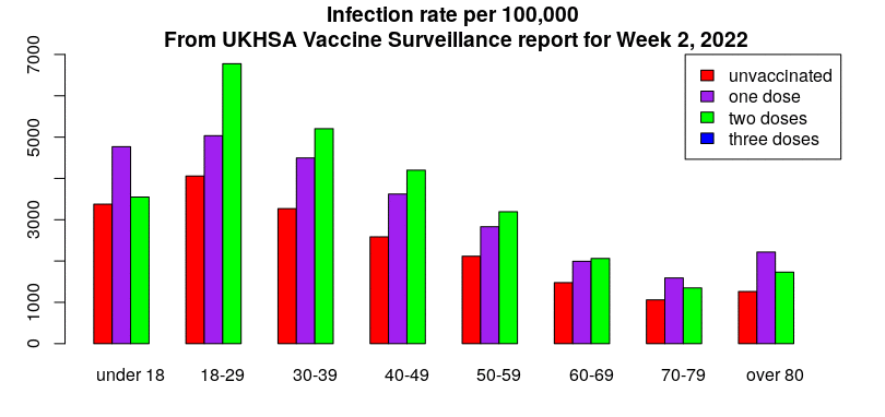
According to the UKHSA data, infection rates continue to drop, infections continue to have lower rates in the unvaccinated and the vaccines continue to increase the risk of infection. The impact of the recent Omicron wave can be clearly seen in the rates data:
This gives an unadjusted vaccine effectiveness of:
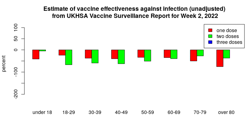
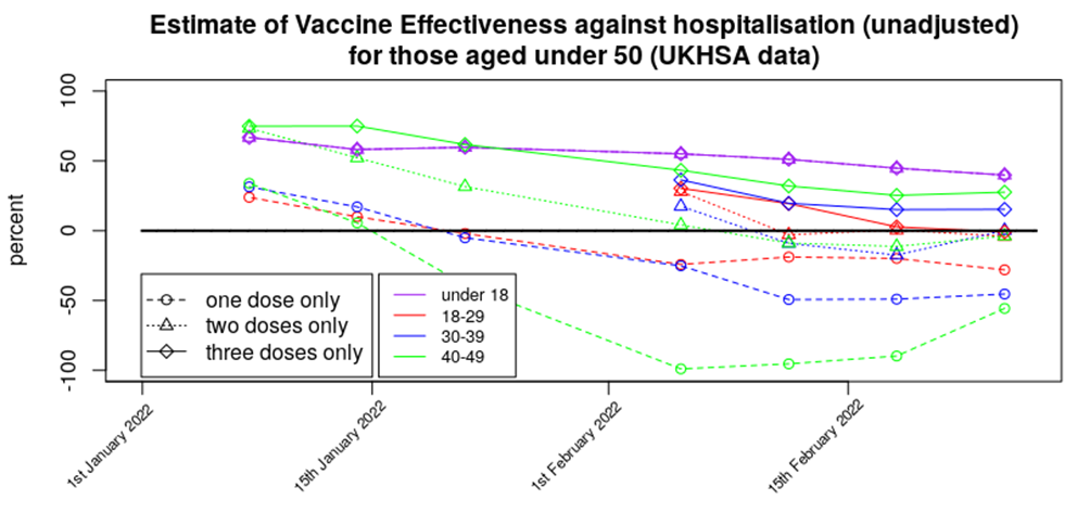
Displayed in this way it can be seen that apart from in those aged under 18 we’re seeing a broadly level but negative vaccine effectiveness for one and two doses, with a rapidly declining vaccine effectiveness for three doses of vaccine.
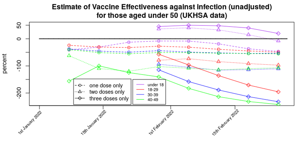
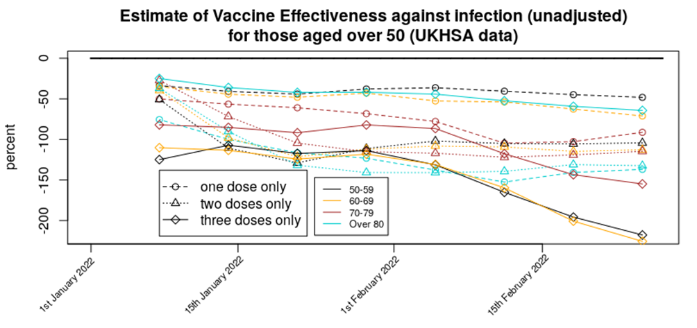
For completeness, here are the above VE data in a standard graphical form:
Method: The infection data come from the UKHSA Vaccine Surveillance Reports. Note that these data are always a week behind and cover a four week period, so the week 9 report covers the period from week 4 to week 8 2022. The vaccinated population numbers come from the NHS vaccination data spreadsheets. Note that there is a difference in vaccinated population between the start of the four week Vaccine Surveillance Report period and its end. Also note that the data in the Vaccine Surveillance report is for >21 days after vaccination (first dose) and >14 days after vaccination (second and third doses). As a result of this we have to use a vaccination point some time before the week of the Vaccine Surveillance Report – we consider the four week period shifted two (one dose) or three (two or three doses) weeks before the Vaccine Surveillance Report window, and use the vaccination data from the midpoint of this period. For example, for this week’s report the cases data cover week 4 to week 8, the vaccination period for the third dose data (>14 days after vaccination) covers week 2 to week 6 and thus we use vaccination data from week 4. The UKHSA uses the vaccination data from the end of the four week period, which will have the effect of artificially reducing rates in the most recently vaccinated population (i.e., currently the booster vaccine).
Are these data reliable? The UKHSA data have appeared to be somewhat reliable up until the end of 2021, but there are now questions regarding how much the infections data in the report reflect actual Covid infections in the population. For example, consider the cases data that have come from the Government infections website (essentially the same as the UKHSA data but with a slightly larger remit), the Zoe Symptom Tracker app and the U.K. Office for National Statistics:
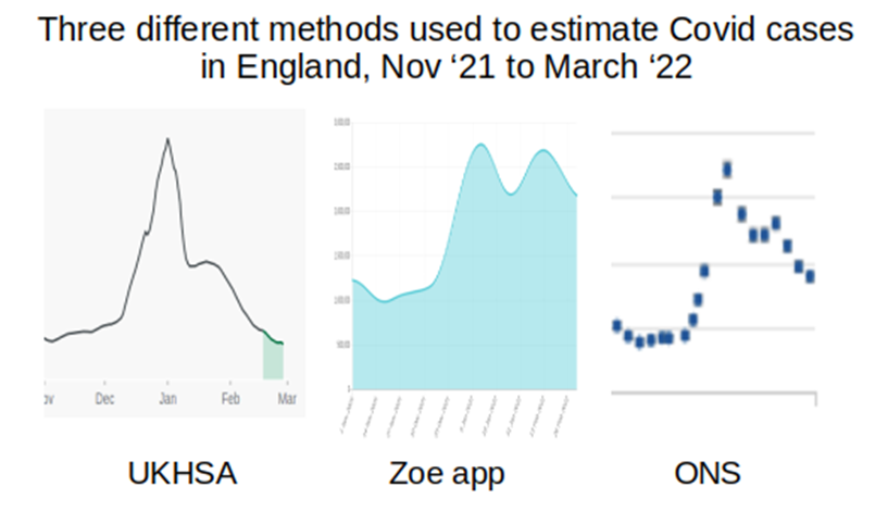
I’ve not included scales in the above, but have adjusted the graphs to cover approximately the same date range (the start of November 2021 to start of February 2022); what is important is the shape of the curves. The UKHSA data suggest that cases are now somewhat below the level they were at last November, the Zoe app data suggest that case levels are now approximately double what they were last November, and the ONS data similarly suggest that case loads are now approximately double the level seen last November. (Note that the UKHSA data are daily infections, while the Zoe app and ONS data are both ‘currently infected’; while this will have an impact on the data, this should not be to the extent suggested in the above graphs.)
Why is there this discrepancy, and where is the ‘real’ level? There is a fundamental difference between the UKHSA data and those of the Zoe app and the ONS – the UKHSA data are a simple count of positive tests, whereas the Zoe app and ONS datasets are the results of a calculation based on asking a large sample of people if they’ve got Covid (whether symptoms of Covid or the results of testing) and applying the proportion of positive cases to the U.K./English population to get an estimate of current infections. It appears that testing is now dramatically lower than it was last November and this is very likely the cause of the the lower case rates found in the UKHSA report; the Zoe app and ONS data are not significantly affected by the testing rate in the country and are thus offer better estimates of the level of Covid infections. I do note, however, that both the Zoe app data and (to a lesser extent) the ONS data are affected by a bias in the motivation of the contributing individuals – Zoe app users have to have been sufficiently motivated to sign up to the app, whereas the ONS data rely on individuals responding to the invitation to contribute. It is of note that neither the Zoe app data nor the ONS data offer sufficiently detailed information by vaccination status (the Zoe data used to show this but they stopped just at the point where vaccine effectiveness turned negative).
There is another potential explanation for the disparity between the UKHSA, Zoe app and ONS data – the UKHSA only includes new cases where any prior case was more than 90 days before, whereas the Zoe app and ONS data measure those currently infected/symptomatic. It is possible that Omicron and/or vaccination has led to longer term/persistent infections, or reinfections within that 90 day period; if this is the case the UKHSA would not report these additional cases.
It is unfortunate that we don’t have sufficiently reliable data on infection rates. This information could be obtained from other sources. For example, the Government could use data on hospital admissions that arise because of accidents – these data would have no motivational bias (because people don’t choose to have an accident and then be tested on admission to hospital) and already exist (as all hospital admissions are tested). It would be best, of course, if there were properly conducted trials into the impact of vaccines in infection rates, but there appears to be little will in Government to properly investigate the impact of the vaccines on reducing Covid rates.
Hospitalisations
Hospitalisation rates continue to decline as the Omicron wave recedes into the distance:
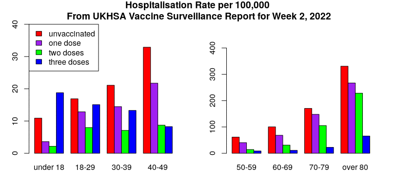
It is worth noting that the hospitalisation rates in the triple-vaccinated don’t appear to have changed (risen then fallen) over the latest report period as much as rates in the unvaccinated, single jabbed and double jabbed; the booster vaccines appear to have done their job in protecting against hospitalisation with/from Covid. However, rates in the single and double vaccinated are higher than in the unvaccinated in all over-18s. Note also how low the rates are for those aged under 60; in this age group there were very few hospitalisations regardless of vaccination status.
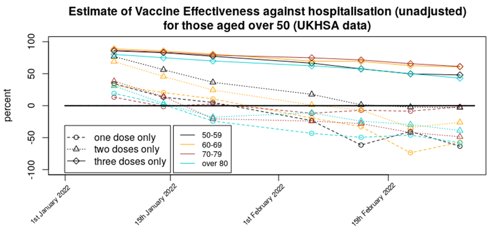
Here are the VE data for protection against hospitalisation in standard graphical form:
Methods: Data were analysed in a similar fashion to the analysis for cases. However, vaccination data were used for the week prior to that used for the same time period for the infections analysis; this was done to account for the delay between symptomatic infection and the disease worsening to the point where medical assistance was sought.
Are these data reliable? Hospitalisation data tend to be reliable; healthcare workers simply test each individual that is admitted to hospital. There is an assumption, however, that the unvaccinated and vaccinated will be equally likely to attend hospital; if there are differences in the propensity to seek medical help between the unvaccinated and vaccinated populations then this could introduce a bias.
In addition, the data doesn’t inform as to the seriousness of the hospitalisation, nor even if the hospitalisation was with Covid or for Covid. Without these crucial aspects to the data it is difficult to tell what practical difference the change in hospitalisation rates has made.
Deaths
Deaths rates appear to have hit their peak and are now declining across all age groups. Here are the death rate data, excluding those aged under 40 (as rates are too low to see clear trends) and those aged over 80 (as death rates are much larger and will be overly affected by with not of deaths.
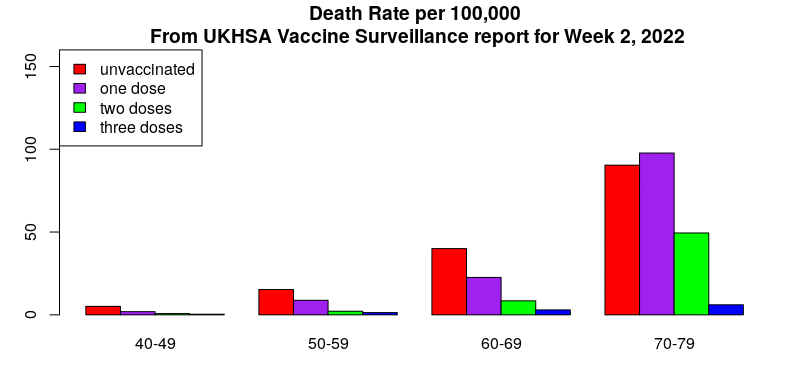
Note how the decline in deaths in unvaccinated, single jabbed and double jabbed is very prominent, but the death rates in the triple-vaccinated appear to not yet be declining significantly. Also note how the deaths in the unvaccinated (red bars) appear to lead the changes, with deaths in the vaccinated following a week or two later. It isn’t clear why this might be.
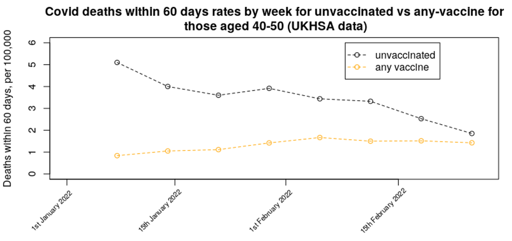
In last week’s data we presented a graph on the relative mortality rate (within 60 days) for unvaccinated versus any number of vaccine doses in the 40 to 50 age range – the updated chart for this week shows a continuation of the decline in mortality rate in the unvaccinated, while the mortality rate in the vaccinated population appears to be maintaining its increased rate. The trend in the data suggests that mortality in those aged 40-50 who have had any number of vaccine doses should rise above the unvaccinated mortality rate either next week or the week after.
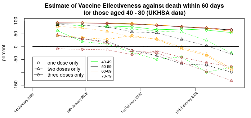
Here’s the VE against death in standard graphical form:
Methods:
Data were analysed in a similar fashion to the analysis for cases. However, vaccination data were used for three weeks prior to that used for the same time period for the infections analysis; this was done to account for the delay between symptomatic infection and death. If the delay between infection and death is actually greater than three weeks then our mortality rates will be lower than they should be.
Are these data reliable?
You’d think they would be – there’s no confusion over the end point (death) – but of course there’s always the problem of ‘with not of’ to consider. But there’s a deeper problem with the deaths data, which is the ‘healthy vaccinee’ effect.
It is worth going into what the ‘healthy vaccinee’ hypothesis means in this context. To begin with, we’re not talking about those who are generally unhealthy or who have unhealthy lifestyles; indeed, people with general health difficulties were targeted for vaccination, not spared it. Instead, in this context we’re talking specifically of those very few that are closest to death; the most very frail of the elderly and those diagnosed with a terminal illness or condition. While there are always deaths due to sudden illnesses, heart attacks, accidents, etc. a good proportion of deaths are expected some time before they actually arrive. These types of deaths are thankfully rare in the young, but become a large proportion of deaths in those over 50 or 60.
Is there any evidence to support this hypothesis that they didn’t vaccinate those closest to death, and how would this bias the results? We have a glimpse of supporting data for this ‘healthy vaccinee’ effect in data available from the ONS on deaths by vaccination status. These data helpfully break down the mortality data into deaths with Covid and deaths not with Covid, and they tell an interesting tale. The data we’re interested in are the mortality rate not from Covid during 2021.
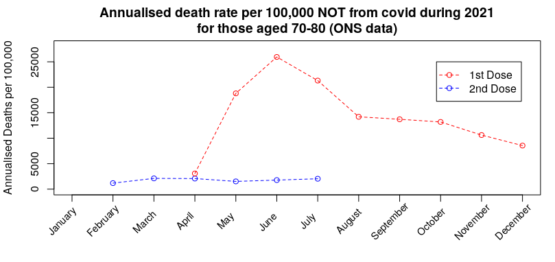
Consider first the first dose of vaccine and what happened to non-Covid deaths in the unvaccinated for those aged 70-80:
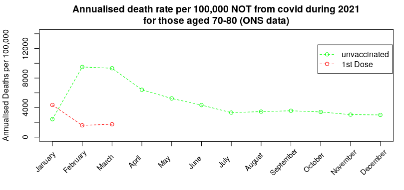
During January there was a spike in non-Covid deaths in those that had received their first dose of vaccine. The ‘healthy vaccinee’ hypothesis proposes that this is when the medical authorities realised that the vaccines were causing high rates of death in those who were very close to death (anyway); at that point they switch policy to not vaccinating those close to death, but because very few in this age range (70-80) chose to not get vaccinated the eventual deaths from those that were close to death get concentrated into the unvaccinated group, resulting in a very high death rate from reasons other than Covid in the unvaccinated, which then slowly reverts towards the background rate.
Three months later they start with the second dose of vaccine – while the vast majority that took the first dose choose to take the second dose, the ‘healthy vaccinee’ hypothesis suggests that there was now a new group of individuals that were deemed sufficiently well to take the first dose but who had by this point deteriorated such that the medical advice was to not take the second jab:
Again, the hypothesis suggests that the spike deaths for any reason other than Covid was due to those that were deemed to ill to take the second jab being concentrated into the one-dose-only group, resulting in a spike in death rate that then slowly reverts towards (but not reaching) the background rate by the end of the year. Note that this spike in non-Covid deaths in the single-jabbed isn’t seen in the unvaccinated (prior graph).
By October the booster dose started to get given in this age group. Once again, while many chose to take the third dose, the ‘healthy vaccinee’ hypothesis suggests that there were individuals that had been deemed sufficiently well to take the second dose, but were not well enough to take the third dose:
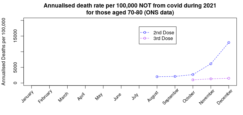
Once again we see the death rate for reasons other than Covid in those not taking the third dose rise without any similar rise in those taking the third dose. Note, again, that there is no similar rise in the unvaccinated or those having taken only one dose (prior graphs).
The important inference is that if the approach taken in choosing which people to vaccinate with each dose has had an effect on deaths from anything other than Covid, there will also be a consequential impact on death rates with Covid.
I believe that this effect dominates the vaccine mortality statistics; the data suggest that each new dose offers significant benefits in protection against death, but this is in reality only the result of sparing each new vaccine dose to those that had become close to death.
Can we get some idea of the impact of the ‘healthy vaccinee’ effect on the Covid deaths data by vaccine status? Prior to vaccination starting (January 2021 is as far back as it goes) and the mortality rate by vaccination status in December 2021 (the most recent data, and close in terms of seasonal effects to January):
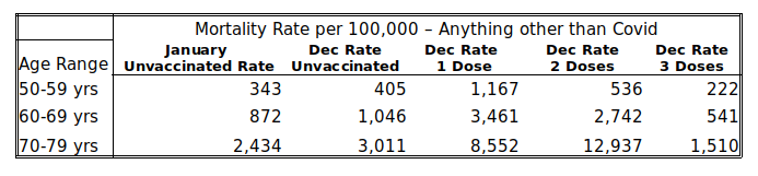
The January mortality rates in the unvaccinated serve as a proxy for the background rate – most people had yet to be vaccinated during the first half of that month, at least. The rates in December then indicate the ‘healthiness’ of those left in the vaccine group, as the vaccines are less likely to affect deaths that aren’t due to Covid (note, this doesn’t mean that there isn’t an increased risk of death following vaccination, only that the ‘healthy vaccinee’ effect might dominate in the short term at least).
Examination of the table above shows that the January mortality rate in the unvaccinated is broadly comparable with their December mortality rate, but the mortality rate in those given a booster is about 45-50% lower than the rate in the unvaccinated. But perhaps this simply means that the vaccines make people healthier? The answer to that comes in the mortality rates in those having received only one or two doses of vaccine – in all cases their mortality rate is multiple times that in the unvaccinated, i.e., it appears that the ‘deaths saved’ in the triple vaccinated are simply moved into the one and two vaccine dose group; the reason that the rates are so much higher is because there are relatively few in the one and two vaccine dose groups, particularly in the older age ranges, and so a relatively small number of deaths gets concentrated into a very small group, increasing the mortality rate for the group as a whole.
Given that we have this decreased mortality rate not from Covid in the triple vaccinated, the immediate suspicion must be that there should also be relatively fewer deaths with Covid in the triple vaccinated. Analysis of the Vaccine Surveillance Report week 9 data shows that there were: 6.3 deaths per 100,000 in the unvaccinated aged 50-59 vs 2.2 in the triple vaccinated, 15.8 vs 6.3 in those aged 60-69 and 57.5 vs 19.4 in those aged 70-79, i.e., in each case the mortality rate in the triple vaccinated was approximately 60% lower than the unvaccinated. Thus it is likely that a large proportion of this reduction in mortality rate that has been attributed to the vaccine is in fact a ‘healthy vaccinee’ effect, and the true impact on mortality is actually far lower.
This then brings us back to that graph of mortality rates in vaccinated (any vaccine) vs unvaccinated in those aged 40 to 50 – most of the ‘healthy vaccinee’ effect appears to have worked its way out of the unvaccinated data (most of those close to death and spared from vaccination have now died), leaving only the single and double jabbed data to show the ‘healthy vaccinee’ effect. Thus by considering all deaths in anyone that has received any vaccine we should remove the ‘healthy vaccinee’ effect. As the graph in question now shows the unvaccinated and vaccinated groups to collectively have similar mortality rates, it is very likely that the vaccines no longer offer any protection against death in those aged 40 to 50 years. I’ll examine this effect for other age groups next week, so long as Russia doesn’t invade Wiltshire.
It is an ongoing crime that there haven’t been more rigorous studies into the impact of the vaccines, whether in terms of reducing (increasing) Covid infection rates, reducing hospitalisation rates from Covid, reducing mortality rates and their negative impact on health unrelated to Covid. We really needed to have the ‘Gold Standard’ of clinical trials – prospective matched cohort studies (matched cohort studies pick groups of people with similar characteristics (e.g. gender, health, morbidity, behaviour) while prospective means that you choose which people go into which group before you start the study). These could have properly removed complications such as the healthy vaccinee effect. Official studies have fallen far short of the gold standard, despite Government experts insisting that they’re the best approach (official measures usually use the test-negative case-control methodology, which is a very useful approach but it isn’t appropriate in all cases, particularly when there are likely to be biases in the test-negative cases).
Other News
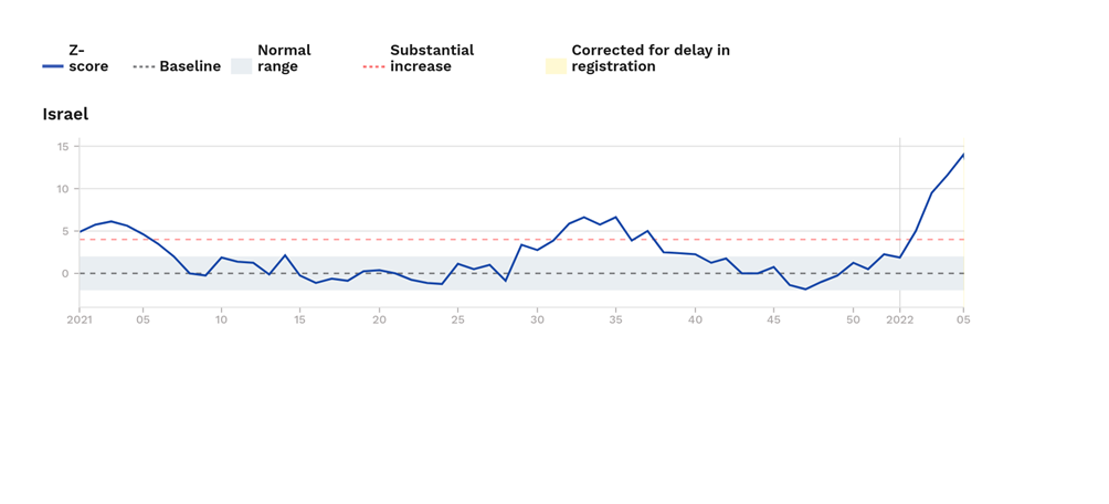
Excess mortality in Israel. Last week I noted that excess mortality was high in Israel in those aged over 65 years. I’m sad to say that things have got even worse; in this weeks Euromomo release their excess deaths rate for those aged over 65 has increased to approximately 14 standard deviations above the normal level for this time of year. Hopefully the death rate in Israel will start to come down soon.
New Zealand. After two years of New Zealand imposing one of the harshest lockdowns in the world and vaccinating a very high proportion of the population (some under mandate), it’s now suffering its first real Covid wave.

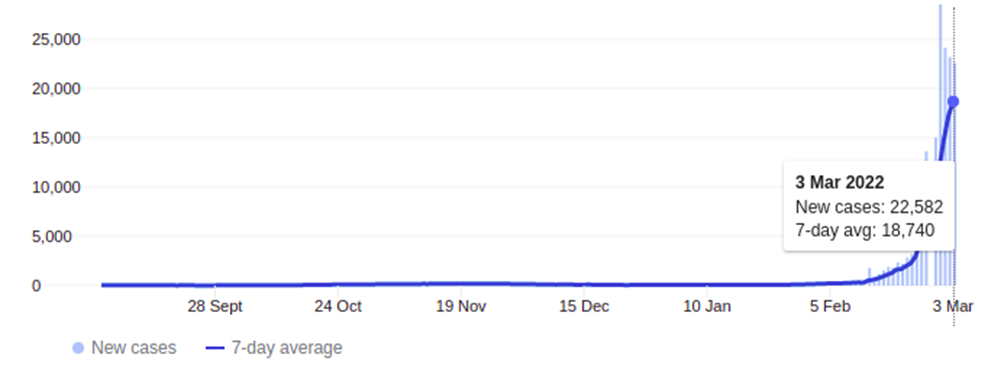
Yesterday it was at 22,582 new cases – and that’s in a country with a population of approximately 5 million people; in the U.K. the equivalent rate would be about 300,000 cases a day. The graph above looks to be starting to roll-over, but this may be because they’re at the limits of their testing capability, not because the increase in cases is slowing down.
On the face of it there is good news from New Zealand – hospitalisations and deaths are very low. However, it looks ‘too good’ – given its huge case numbers there should be approximately 50 deaths a day in the country with Covid, but instead it’s only had 10 since the start of this Covid wave. It very much looks as though the New Zealanders are only recording a Covid death when there is no other potential reason for the death, rather than the much more broad Covid mortality categorisation in the U.K. and most other countries. Thus the death rate from/with Covid in New Zealand doesn’t appear to be easily compared with the death rates seen in other countries.
Amanuensis is an ex-academic and senior Government scientist. He blogs at Bartram’s Folly.
It is my sincere desire to provide readers of this site with the best unbiased information available, and a forum where it can be discussed openly, as our Founders intended. But it is not easy nor inexpensive to do so, especially when those who wish to prevent us from making the truth known, attack us without mercy on all fronts on a daily basis. So each time you visit the site, I would ask that you consider the value that you receive and have received from The Burning Platform and the community of which you are a vital part. I can't do it all alone, and I need your help and support to keep it alive. Please consider contributing an amount commensurate to the value that you receive from this site and community, or even by becoming a sustaining supporter through periodic contributions. [Burning Platform LLC - PO Box 1520 Kulpsville, PA 19443] or Paypal
-----------------------------------------------------
To donate via Stripe, click here.
-----------------------------------------------------
Use promo code ILMF2, and save up to 66% on all MyPillow purchases. (The Burning Platform benefits when you use this promo code.)


I look at the headline and think.
Tell me the injections are destroying the injected ‘s immune systems without saying it
Another moronic covid phoney story. Pathetic for TBP