

Guest Post by E.J. Antoni
For convenience, here’s all the info on the Mar jobs report in a single thread – sorry to be the bearer of bad news, especially regarding American citizens losing so much ground in this economy… 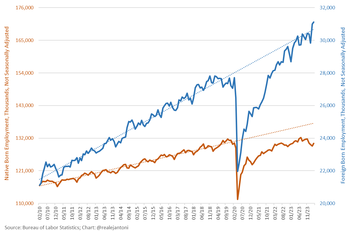
The headline numbers once again look good w/ over 300k payrolls added and the employment number from the household survey rising even faster, but what kinds of jobs are being created? Turns out they’re all part-time: 
And this isn’t new – it’s a continuation of a long trend: full-time employment is lower today than Feb ’23 w/ all of the net job creation since then being part-time work: 
Why the surge in part-time employment? Many Americans have been laid off and replaced 1 full-time job w/ 2 or 3 part-time ones; people are also picking up additional jobs to make ends meet in a cost-of-living crisis; this has caused an unprecedented divergence between the household and establishment surveys, since the latter double counts individuals w/ multiple jobs while the former survey shows a net loss of jobs since Aug ’23:
Number of people w/ multiple jobs jumped again in Mar but remember that this figure only increases when someone gets a 2nd job; if you’re already working 2 gigs and pick up a 3rd, you’re not counted again – at least not here; but you ARE counted again in the nonfarm payrolls… 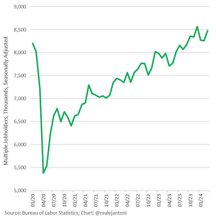
W/ the shift to so much part-time work, average hours worked per week has trended down for over almost 3 years and is below the pre-pandemic average; your hourly wage raise doesn’t do much good when it’s combined w/ a cut in your hours: 
Another disturbing datum point: too many jobs are in gov’t; the economy isn’t adding enough private-sector jobs to support number of workers gov’t is hiring; Mar’s ratio was about 3:1, nowhere near sustainable, especially since those private-sector jobs were all part-time, generating less tax revenue than average full-time job:
Let’s break down the annual change in private sector for a closer look: we find the fastest growing sector was health care, which is dominated by gov’t; most of the hiring over the last year came directly or indirectly from gov’t – even the construction jobs were mostly financed w/ gov’t guaranteed loans on projects that aren’t profitable (which is why the private sector wasn’t undertaking those projects)…
We’d rather see good-paying blue-collar manufacturing jobs taking the lead, but that sector has been anemic: employment is up a mere 0.1% since Jan ’23, having added zero jobs in Mar ’24: 
And while it’s good to see the labor force participation rate climb, we’re still way below the pre-pandemic rate, and that’s hiding the true level of unemployment by excluding millions of workers from the calculation: 
You can see that the labor force is clearly below its pre-pandemic trend: 
And we see the same thing w/ the employment-to-population ratio: 
As well as the number of nonfarm payrolls from the establishment survey: 
And yet again in the employment level from the household survey: millions below the trend: 
The Bureau of Labor Statistics even has a category of people called “not in labor force” and it’s about 5 million above the pre-pandemic level, and waaay above the pre-pandemic trend which had begun trending down in about Set ’18: 
So, if you account for the millions of people who are clearly missing from the labor market today (and therefore are not employed), you can calculate that the unemployment rate isn’t 3.8% but btwn 6.5% and 7.7% depending on which dataset and methodology you prefer to use: 
But who is getting these jobs? It’s not native-born Americans, but foreigner workers – the former lost 651k jobs over the last 12 months, while employment of foreigners rose by 1.3 million: 
And again, this is the continuation of a trend where Americans have been completely left behind in this economy; foreign-born employment is not only several million above its pre-pandemic level but is even above its pre-pandemic trend, while native-born Americans have made no progress in 4 years – in fact, they’ve gone backwards; a quick note on the different axes here: this chart was constructed so that the different values on the left and right axes are proportional; that means if both groups had the same rate of increase, the lines would have the same slope; also important is that these are not seasonally adjusted datasets so month-over-month changes are as apples-to-oranges comparison in most cases, while year-over-year changes do not have that issue; you can still create a seasonal adjustment yourself, it’s just not provided by BLS; lastly, some have tried to blame the decline of native-born employment on Americans retiring, but that would only be enough of a change to slow the rate of growth, not turn it into decline:


Great jobs, or great report?
Great fiction. Only a stupid useless idiot believes the lies coming out of WDC now. Mar24 new full-time jobs was probably a negative number and actual unemployment probably went up. The BLS numbers probably came from their Wizard of Oz Computer.
The first any government report is always a fiction, the revised one is always closer to reality, but never actual reality.
“pre-pandemic level”
No pandemic, only lockdown. Sick of this talk. It was a LOCKDOWN, not a pAndEmIc.