

If you are visually oriented, the four charts below will explain all you need to know about our “strong” job growth. LF stands for Labor Force. The BLS decides whether you are in the labor force or not, based upon whatever their politician bosses tell them to report. If you have been out of work for too long, you’re not in the labor force. If you have been turned down for 50 job openings and have thrown in the towel, you’re not in the labor force. If you take a $40,000 Obama student loan and enroll at the University of Phoenix in Transgender Studies, you’re not in the labor force.
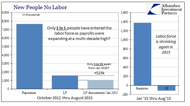
Far more working age Americans are leaving the workforce than getting jobs.
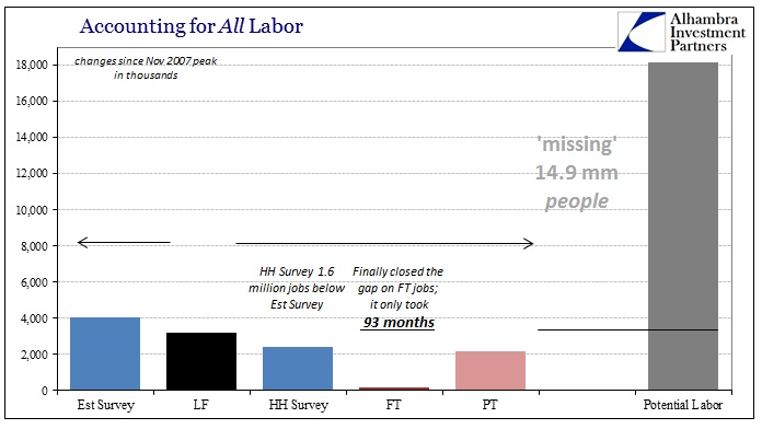
One BLS survey says 4 million new jobs have been created since 2007. Another BLS survey says only 2.4 million new jobs have been added since 2007. Of those 2.4 million jobs, over 2 million of them are part-time low paying shit jobs.
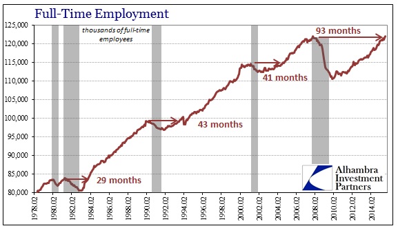
Does this economic recovery look like past economic recoveries? It has taken 8 years for full-time employment to reach its previous peak. The 93 months is more than twice as long as all previous economic recoveries. And this is as good as it gets. We are back in recession and job losses will accelerate over the next year.
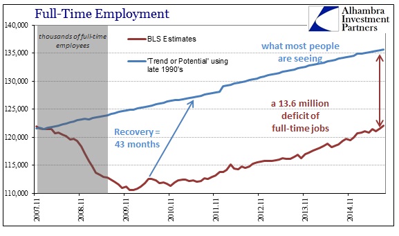
If you were wondering why households are struggling to make ends meet and retail sales are in the shitter, maybe it has something to do with the 13.6 million deficit in good paying full-time jobs.
Our economic system has been artificially propped up with trillions in newly created debt, benefiting only the .1% bankers, corporate executives, military industrial complex, sickcare complex, and political class. Bernanke’s new job of collecting $300,000 for lunchtime speeches at Wall Street banker greedfests tells you all you need to know about the true state of our jobs market. The debt issuance is reaching its pinnacle and the crash is going to be epic, making 2008/2009 look like a walk in the park. Get prepared.


Viewing the 1st Full Time Employment Chart, it appears that full-time employment will begin to pick up steam. This is determined, without including any other factors, by noting the 3 prior instances on the chart when the ‘recoveries’ occurred.
Other factors are important.
I would like to make a bet that shortly the line goes down from this top (based on those other factors you didn’t include).
robert….I don’t make predictions, but I do observe chart data and deduce the ‘probable’ outcome. If you read my post on the TBP article Is the Stock Market now Too Big to Fail?, you should understand my reasoning.
Have an enjoyable and relaxing the Labor Day weekend.
Workforce participation rates are more important to track than simple employment numbers.
And they’re not looking like they are going to get much, if any, better anytime soon.
Admin: your is not in the labor force? I think you mean “you’re not in the labor force”.
Damn website formatting removed not only my emphasis (via angle brackets) on the word WHAT but also the word itself: “your WHAT is not in the labor force?”
Araven
Thanks for catching that. Not enough coffee when I made the post.
Also, thanks for the generous donation.
Outside of my ODC issues I really like this. Short, simple, to the point, and easy to understand explanation of what the job market really looks like. 🙂
No problem. I’ve been reading TBP for years, but there were a few years when I was out of work so I couldn’t donate. So you could say that I owed you 🙂
Greetings,
I think that there is a lot more going on than anyone can wrap their minds around – especially on a Sunday morning.
First, I’m not an expert on the BLS but their history suggests that they are dishonest and shills for whatever numbers Wall St. happens to want.
Second, I’m fairly certain that many of the doomers, to include companies like Alhambra crank out these dismal charts because they too have a product to sell. We should be equally suspicious of the doomers as well.
Third, I suspect that a significant portion of the economy is now underground and unmeasurable. Numbers vary but articles in Time, Forbes & USA Today suggest that somewhere between 10 million households and up do not have bank accounts. This leads me to believe that these households provide for themselves in the underground economy which is not being talked about.
I see a number of check cashing places that seem to serve our local population of illegal aliens. After all, they go to work each and every day and somehow have places to live, cars and groceries to consume yet would not be measured by either the BLS or the Doomers. I also know auto mechanics, painters, framers & and landscapers that only work for cash. Are they counted in these surveys?
Think about this: Those of us with Hard Skills can work for cash and barter.
In the end, I do not believe that things are as rosy as the BLS would have us believe but not as horrific as the worst of the numbers (23%) that you might find on Shadowstats. I can not prove it but my hunch is that it falls somewhere in-between.