Visualizing The $86 Trillion World Economy In One Chart

Via ZeroHedge

The world economy is in a never-ending state of flux.

The fact is that, as Visual Cpiatlists’ Jeff Desjardins notes, billions of variables – both big and small – factor into any calculation of overall economic productivity, and these inputs are changing all of the time.

Buying this week’s groceries or filling up your car with gas may seem like a rounding error when we are talking about trillions of dollars, but every microeconomic decision or set of preferences can add up in aggregate.

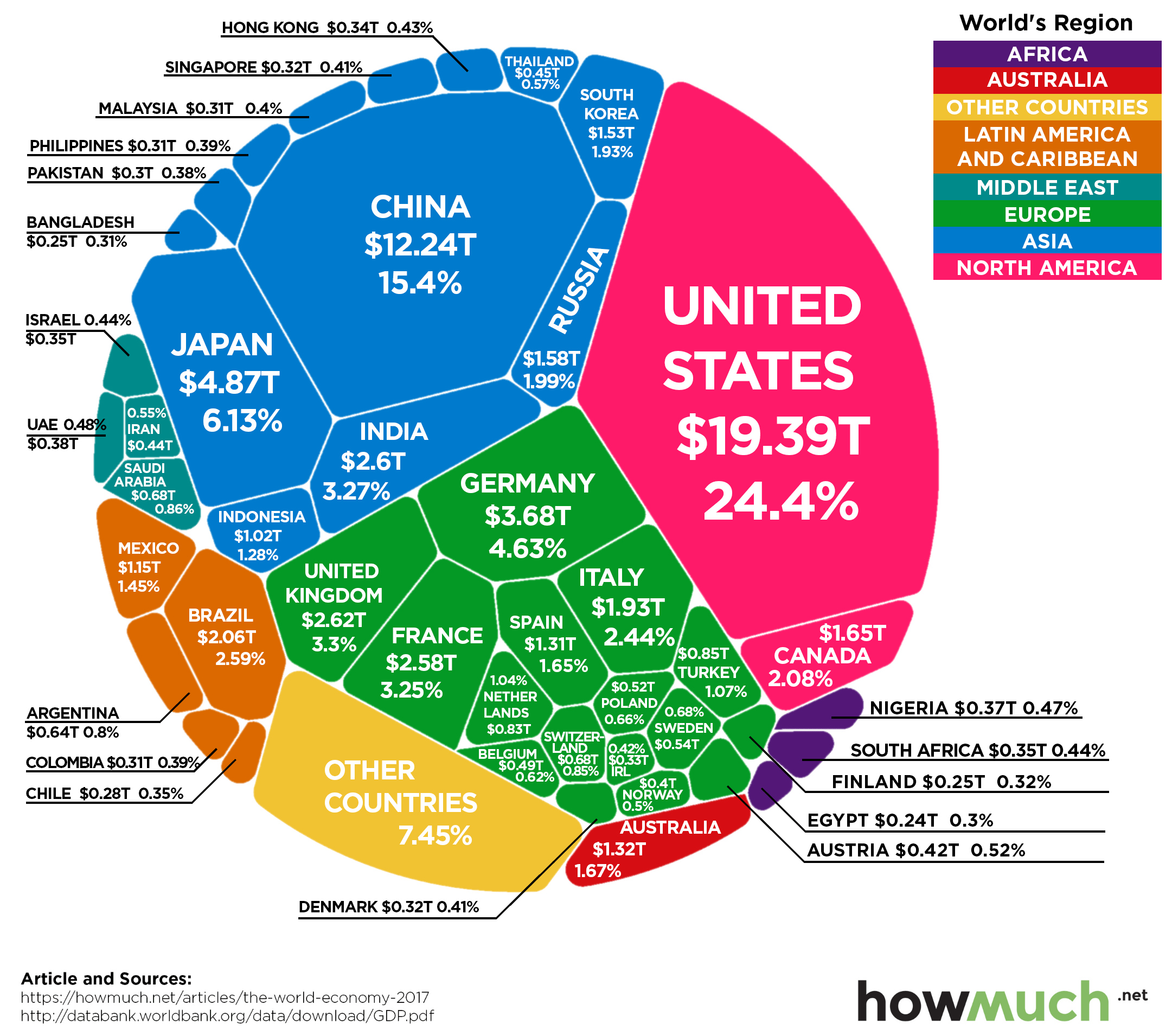
And as consumer preferences, technology, trade relationships, interest rates, and currency valuations change — so does the final composition of the world’s $86 trillion economy.

Continue reading “Visualizing The $86 Trillion World Economy In One Chart”

The World Economy in One Visualization

If itsy bitsy pie slice – Greece (.33%) – can create this much worldwide economic havoc because of their unpayble level of debt, imagine what will happen when the truth is revealed about France (3.81%), Italy (2.88%), and Spain (1.88%). China’s (13.9%) entire economic model has been built upon debt and the world consuming their output. The world has run out of money to consume their shit. Japan (6.18%) is in the midst of a demographic and debt death spiral. The U.S. (23.32%) is living on borrowed time and the continued dominance of the USD. How long will it last? We are inhabiting in a world stacked with TNT run by monkeys with matches.

Courtesy of: Visual Capitalist
Today’s data visualization is the most simple breakdown of the world economy that we’ve seen. Not only is it split to show the GDP of dozens of countries in relation to one another based on size, but it also subtly divides each economy into its main sectors: agriculture, services, and industry. The lightest shade in each country corresponds to the most primitive economic activity, which is agriculture. The medium shade is industry, and the darkest shade corresponds to services, which tends to make up a large portion of GDP of developed economies in the world economy.To take it one step further, the visualization also shades the countries by continental geography, to easily see the relative economic contributions of North America, Europe, South America, Asia, Oceania, and Africa.